Applications are Currently Open for All 2025 & 2026 Terms --- Intersession, Summer, Fall & Spring Application Fees Waived for Domestic and International Students Summer and Fall 2025 Apply Now
Origins of Belief: Academy of Art University’s 2025 Spring Fashion Show
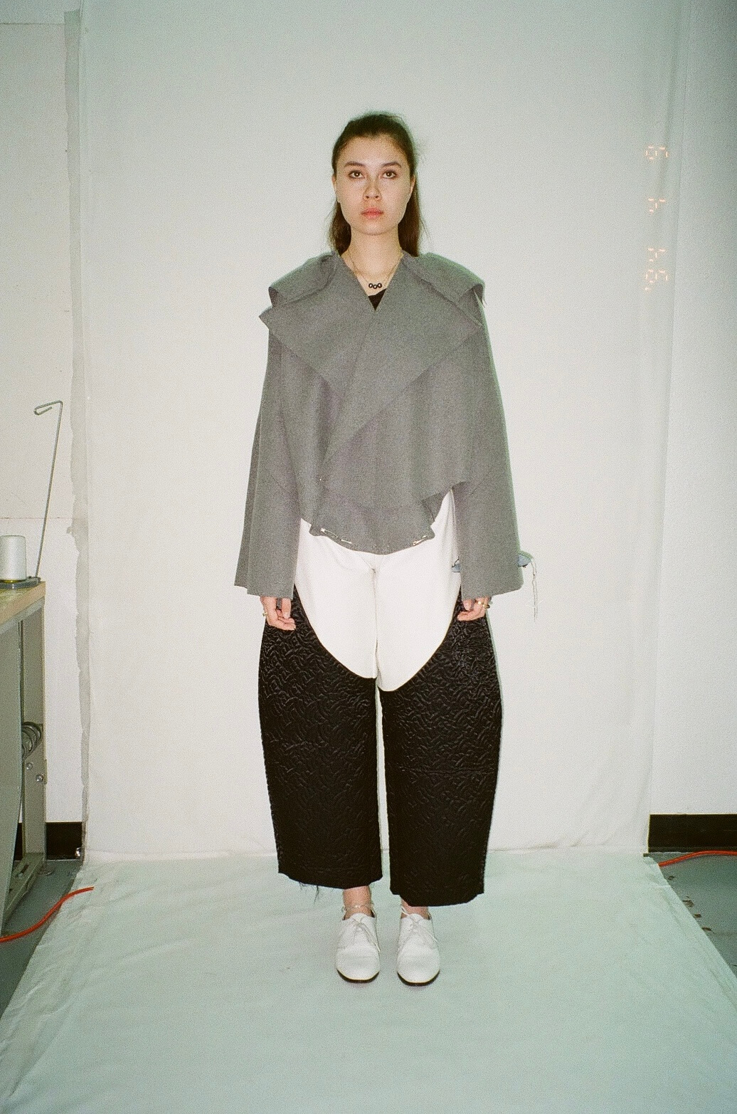
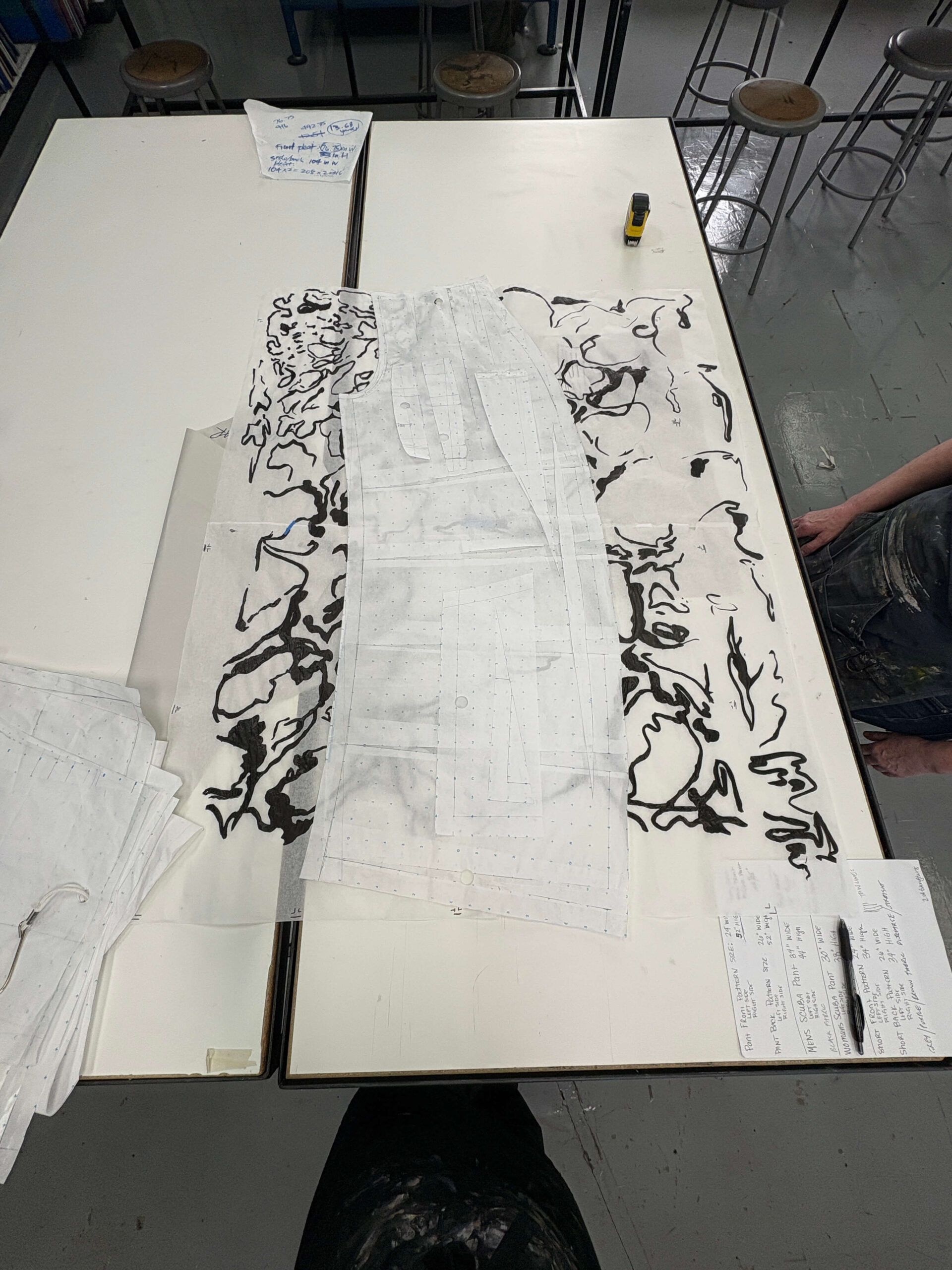
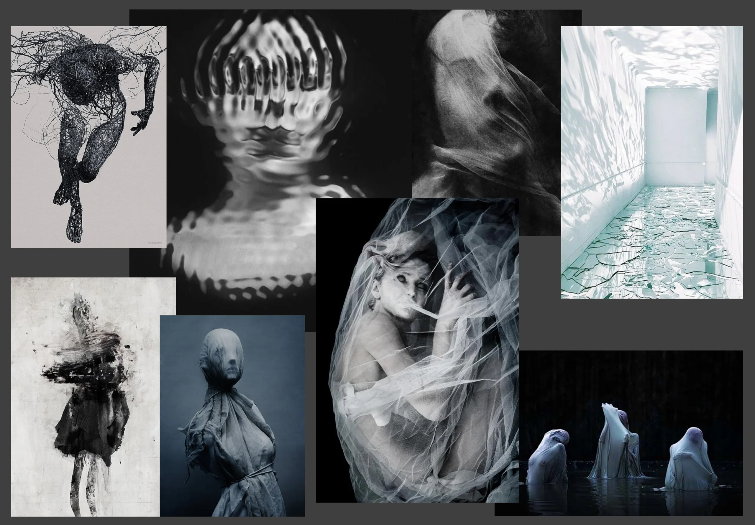
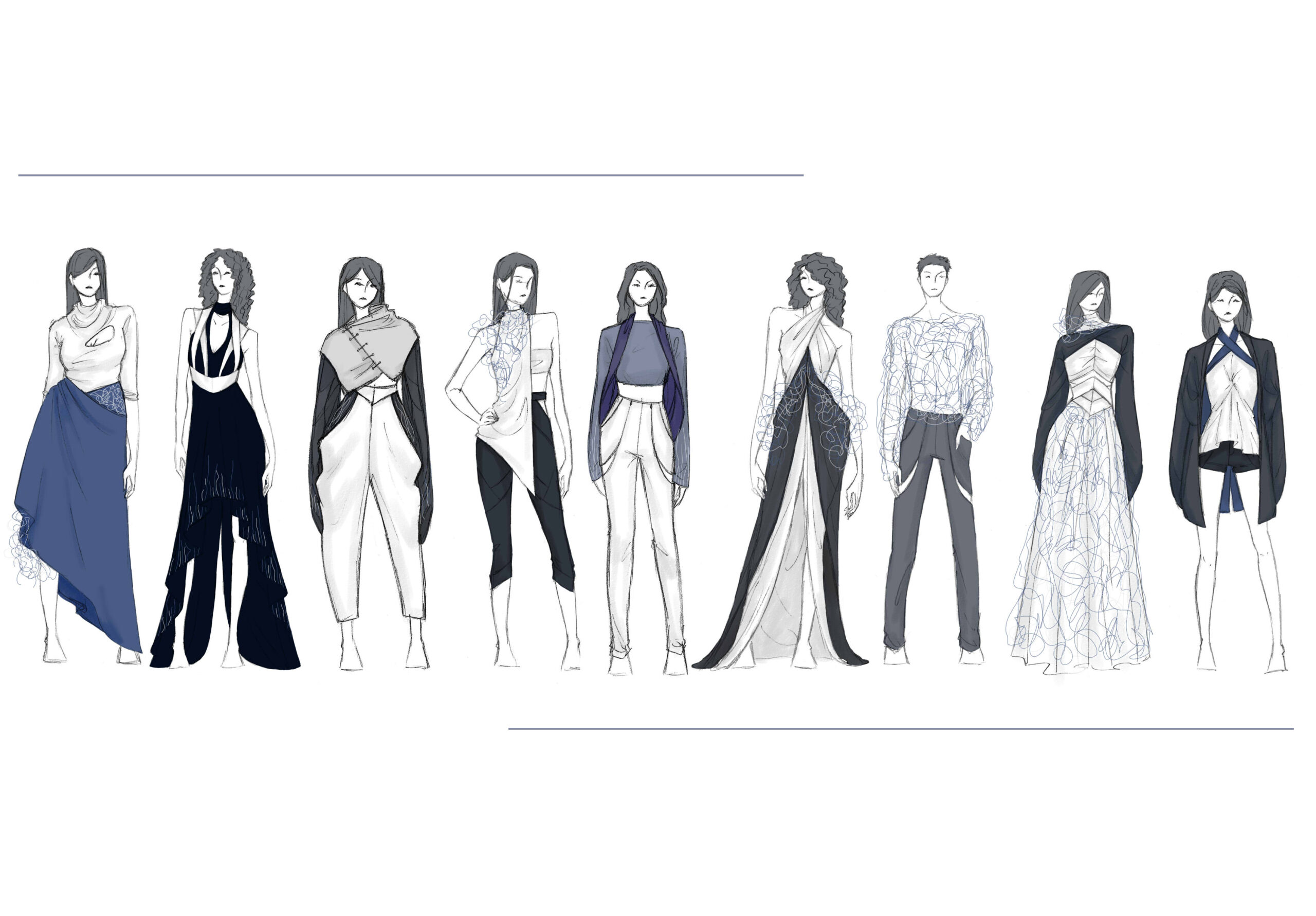
The 2025 Runway Show introduces the groundbreaking work of 17 of our school’s finest fashion and textile designers presenting a wide range of unique and wildly creative collections. The show features a powerful mix of themes: the challenges of neurodiversity, religious faith, the trauma of abuse, the majesty of our natural world, the inspiring world of sports, and many more—all brought to life through innovative materials and stunning fabrics. Collectively, there is also a clear focus on the importance of sustainability.
Over the past nine months, these designers have pushed boundaries—creatively and personally—to arrive at this auspicious moment. The work on display represents untold hours of research, discovery, ideation, creation, and refinement; it rivals anything you might see on the runways of New York, Paris, or Milan.
Watch The 2025 Spring Fashion Show Livestream
May 8, 2025 at 7:00PM PDT
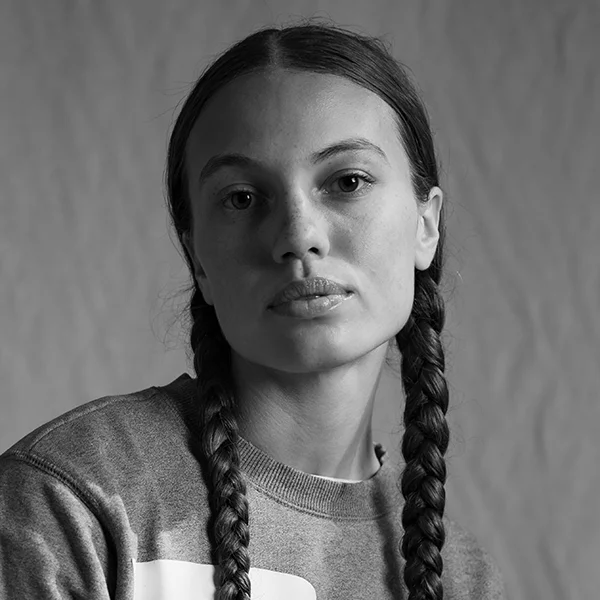
Meet the Designers
Read the stories behind these talented student designers. Select an image to uncover the inspirations behind their collections.
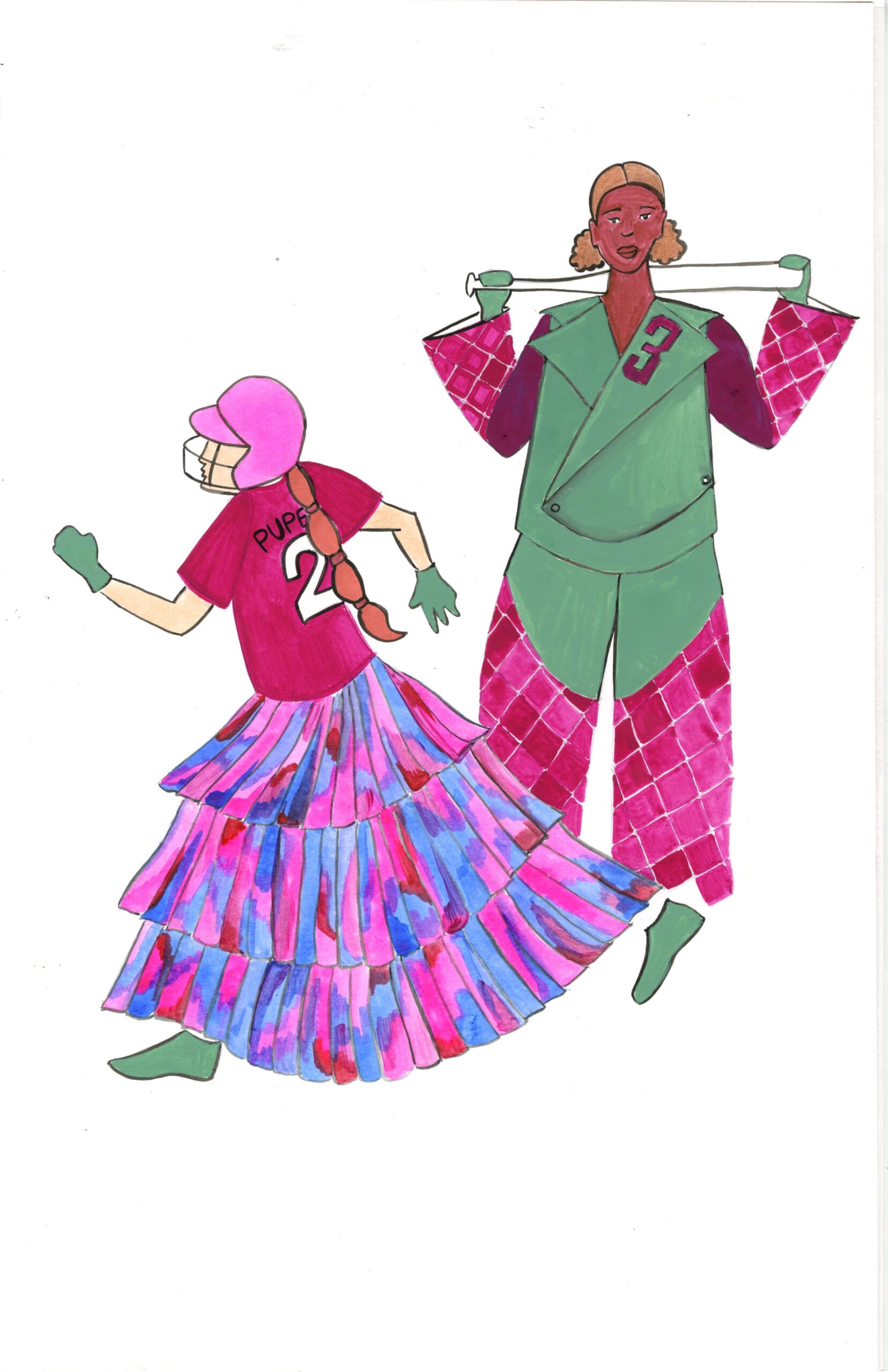
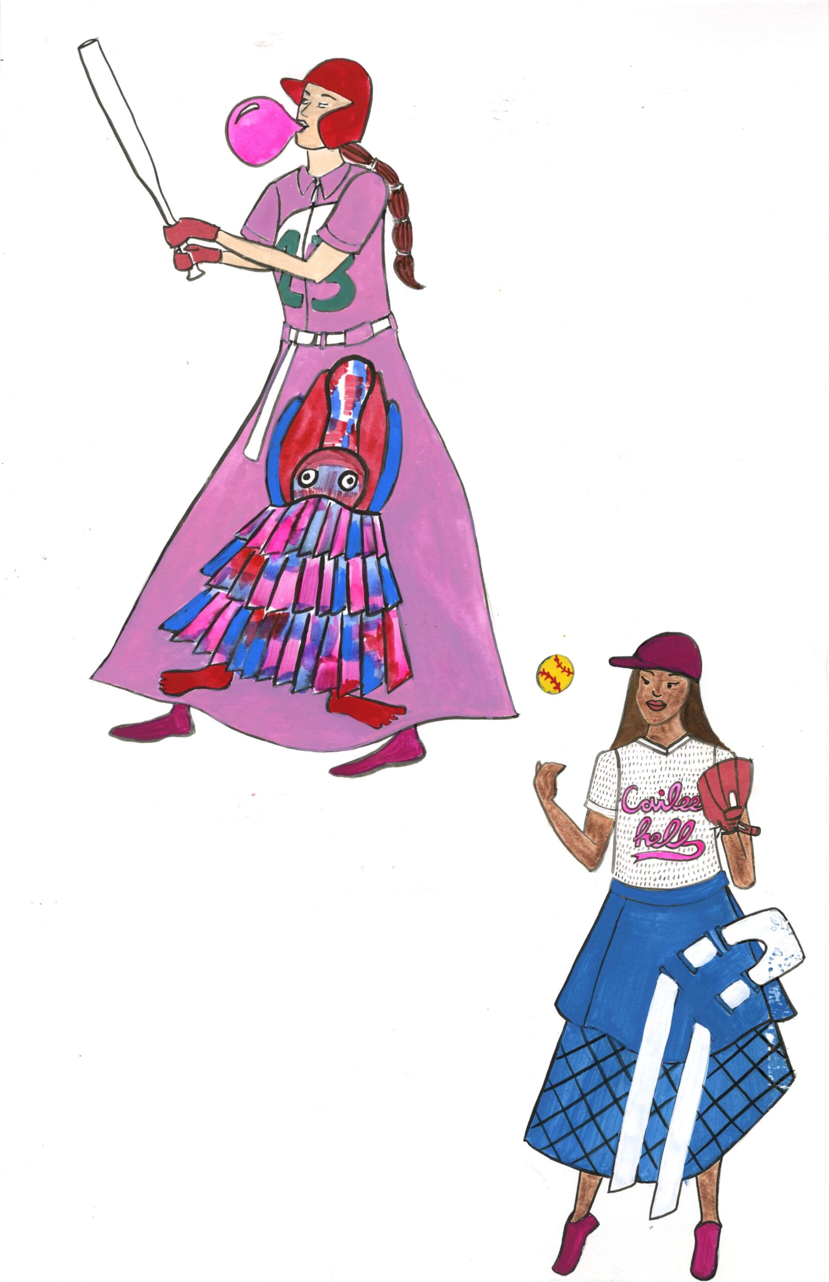
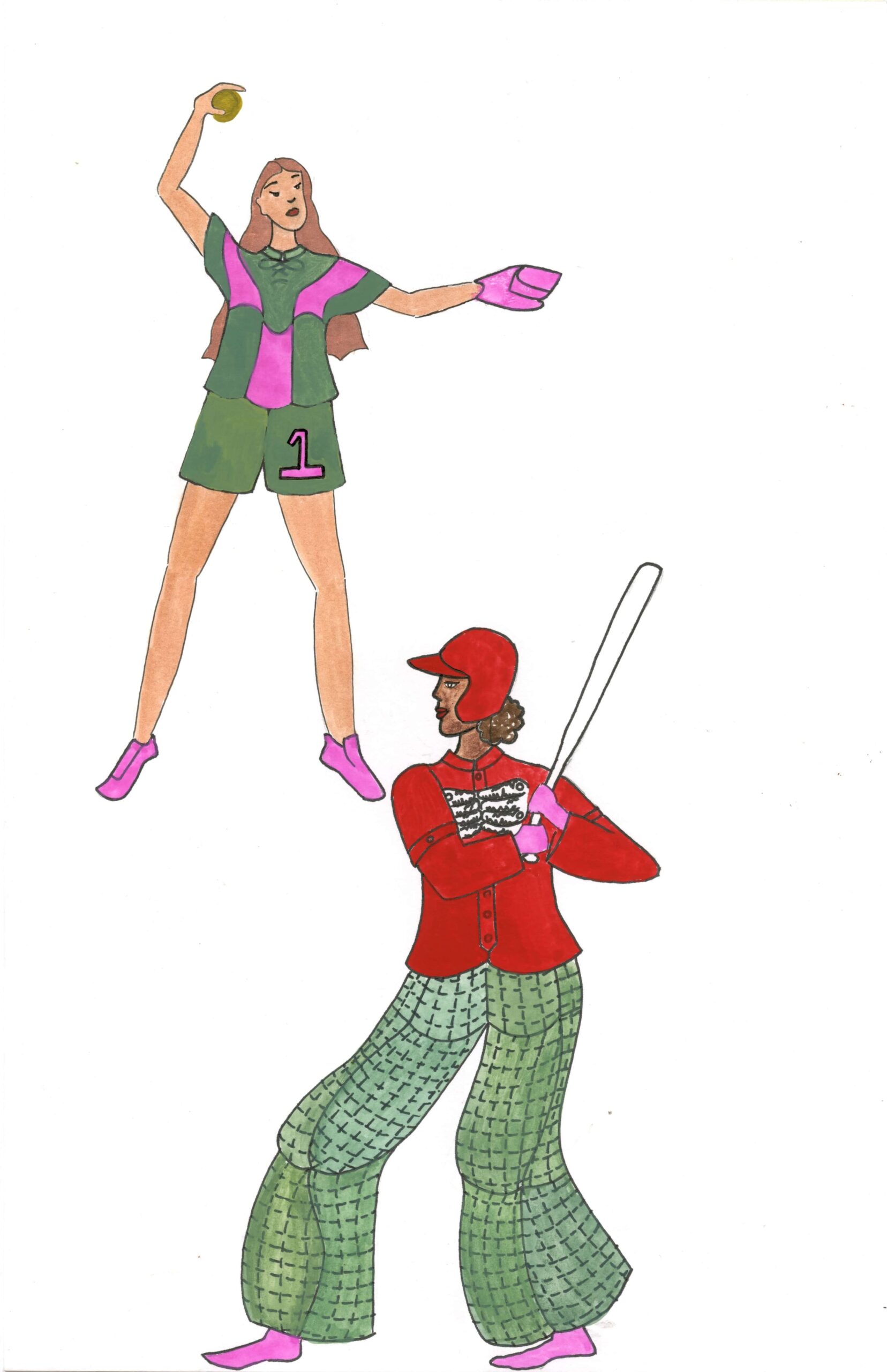
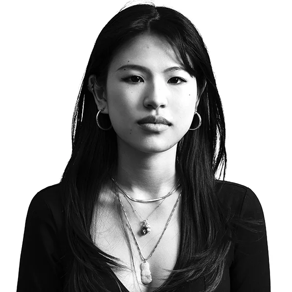
Cailee Lola Grayhorse
Pupecki
BFA Fashion Design
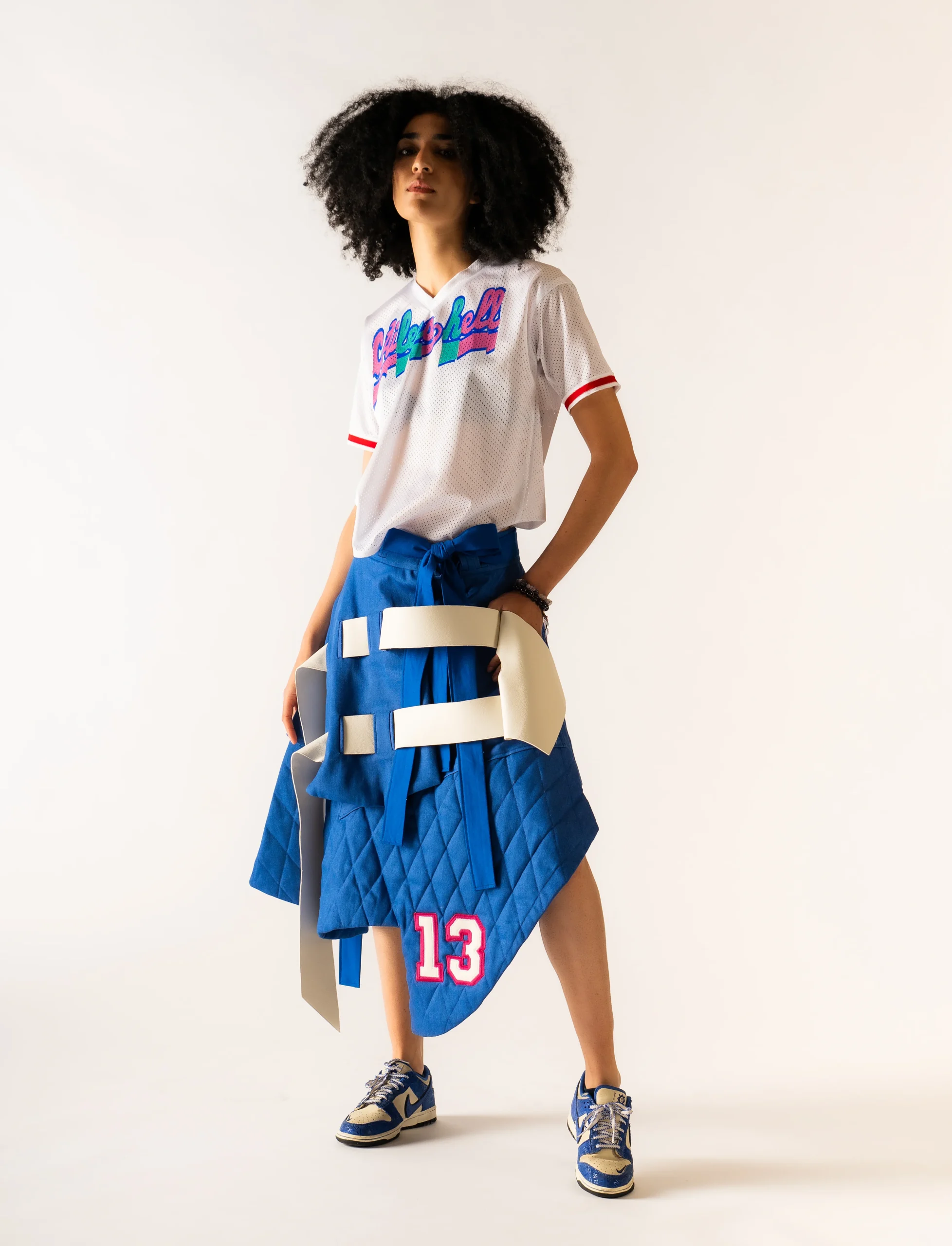
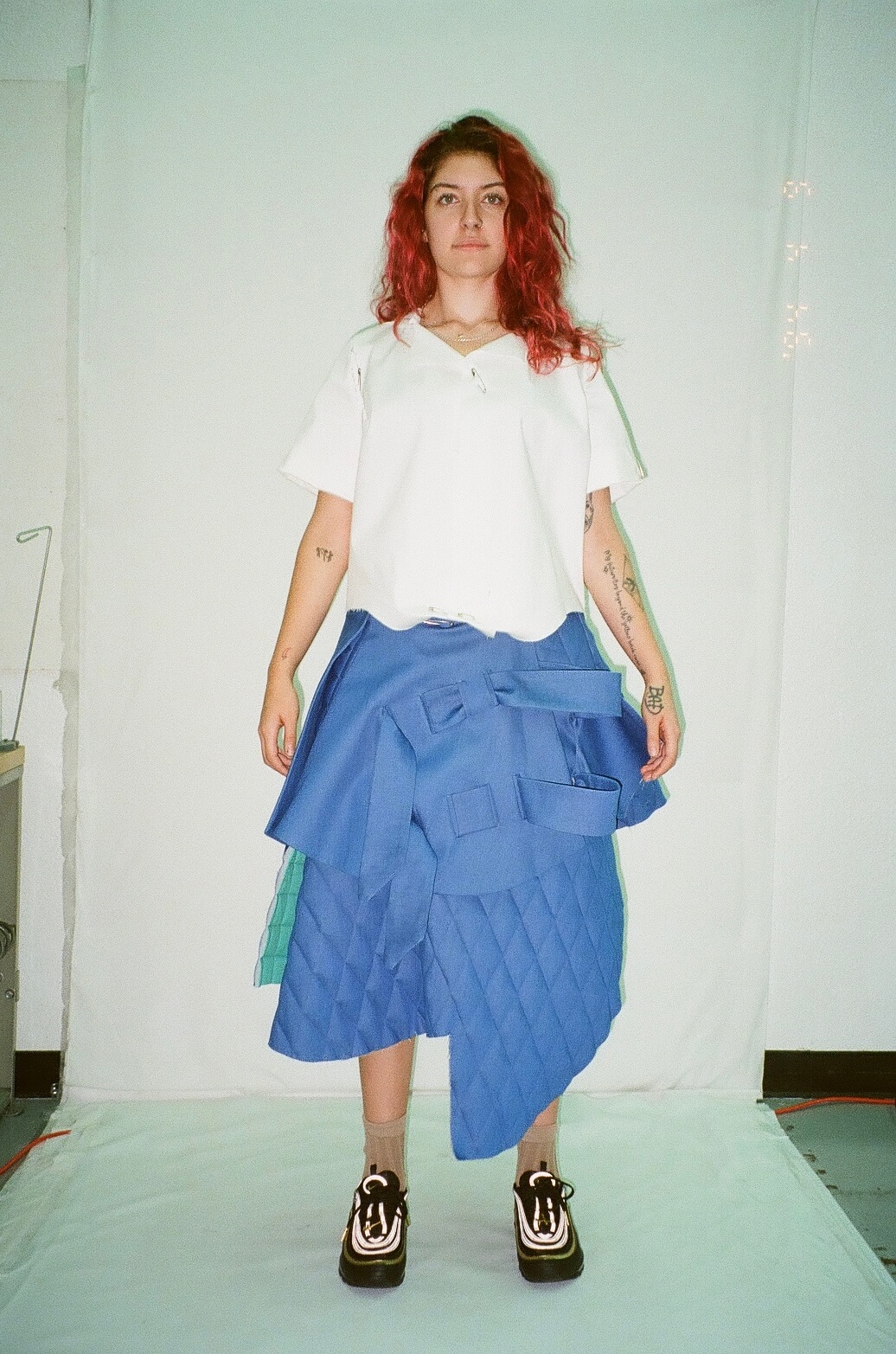
A collection by Cailee Lola Grayhorse Pupecki, B.F.A. Fashion Design, is a love letter to the sport that shaped her. “That’s why I decided to make softball uniforms—just to show my gratitude for the sport and also my gratitude for the sisterhood that I’ve created,” said Pupecki.
Originally from Southern California, Pupecki played softball for 15 years. Her designs reinterpret traditional baseball and softball uniforms through an unexpected lens. “I researched a lot of old baseball and softball uniforms and then created new uniforms,” said Pupecki. “When I say unconventional, it’s like I’m having people on the field play in suits or dresses, or skirts—things you really wouldn’t expect.”
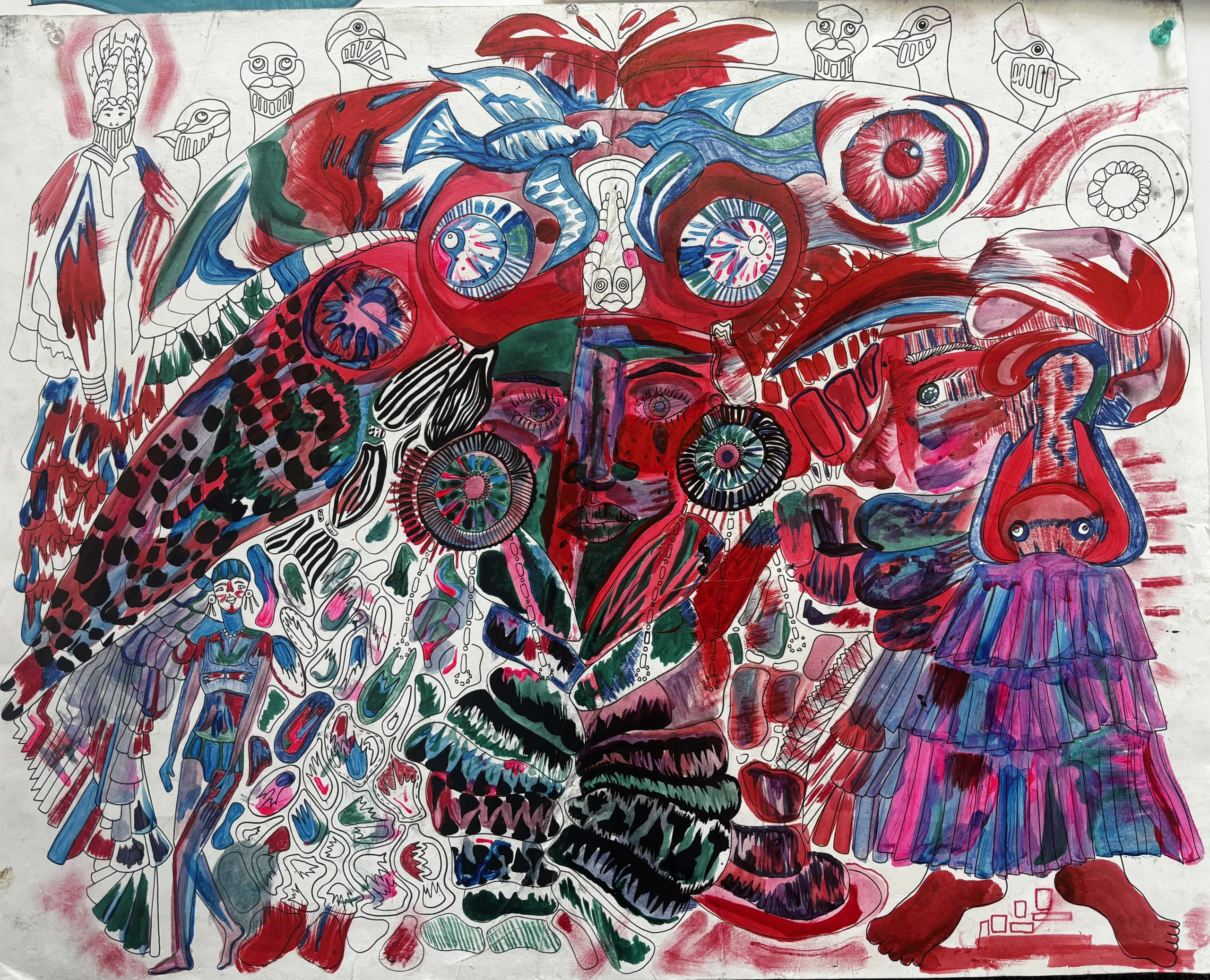
Pupecki draws heavily from personal experience and visual symbolism. One of her standout illustrations features pigeons, that she connected with the university mascot, the Urban Knight. “When I first heard it, I thought a pigeon could be an Urban Knight in the city because there’s so many of them—like an army.”From that idea, Pupecki developed Pajane, a fictional pigeon character who appears throughout her collection.
She has titled many of her looks to reflect their character and silhouette. “The Bubble Look,” featuring oversized, rounded pants, is one of her favorites. There’s also “The Catcher Look,” a top that mimics a catcher’s gear, and “The Padded Suit,” inspired by the quilted padding of vintage baseball pants.
As her collection evolves, Cailee continues to explore what happens when athletic wear becomes art. Each look in her lineup is stitched with story, memory, and a sense of transformation. “The softball taught me a lot,” she shared. And now, she’s returning the favor—uniform by uniform.
Cailee Lola Grayhorse
Pupecki
BFA Fashion Design
Chase Duval-Champagne
MFA Fashion Design
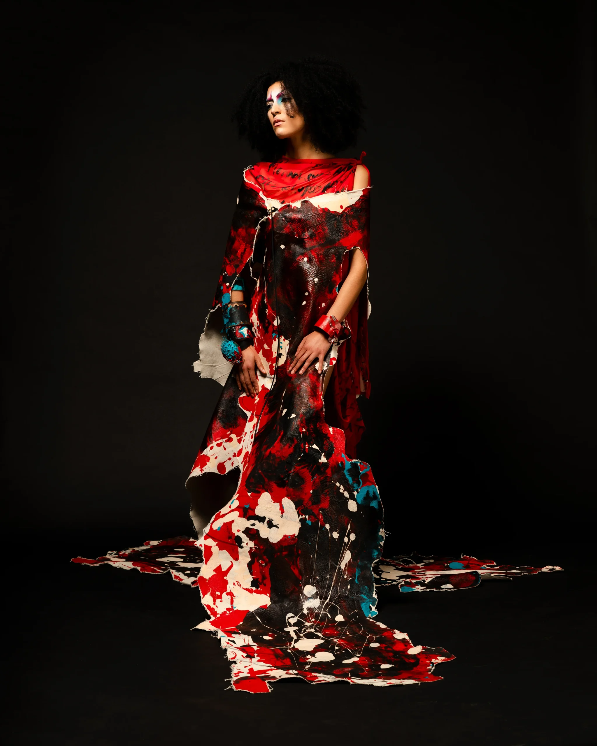
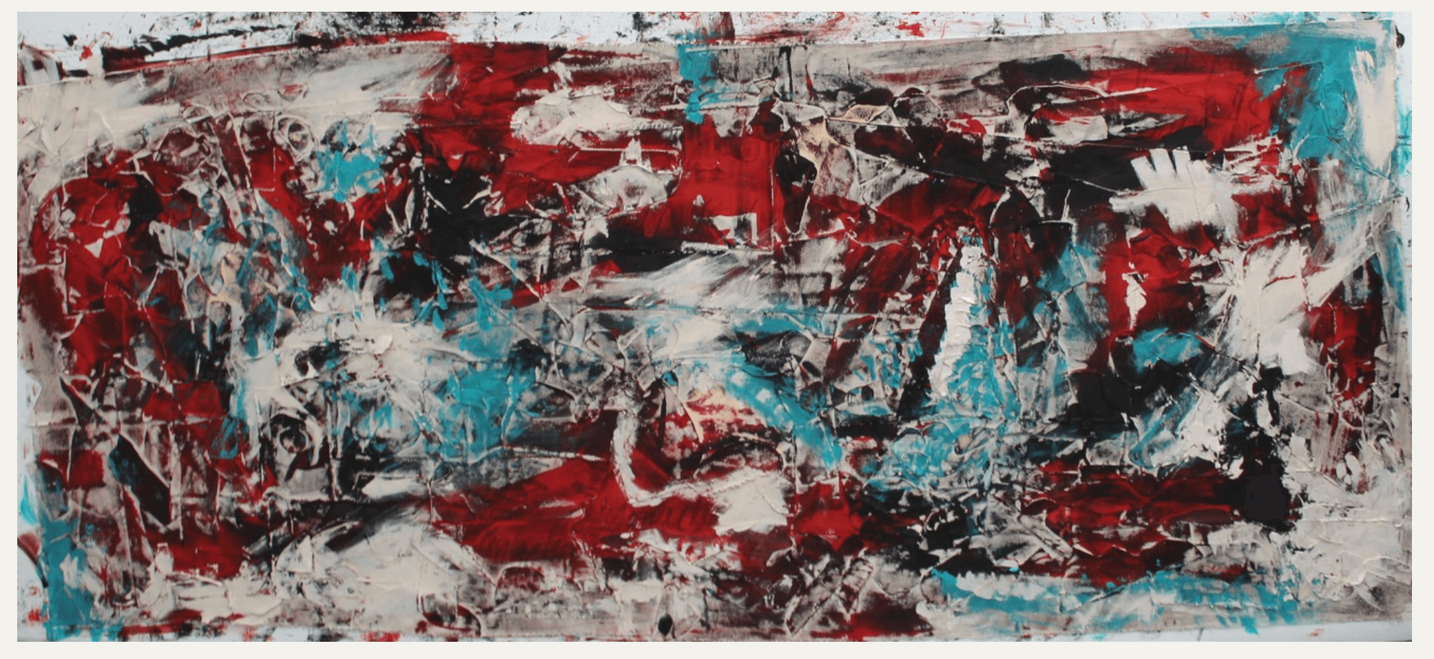
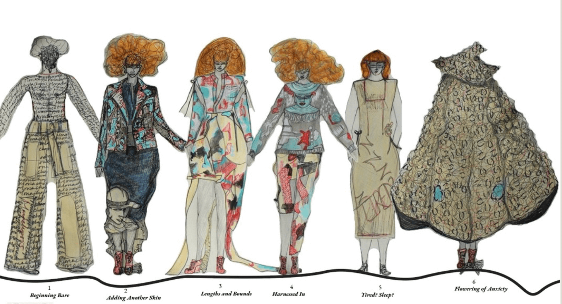
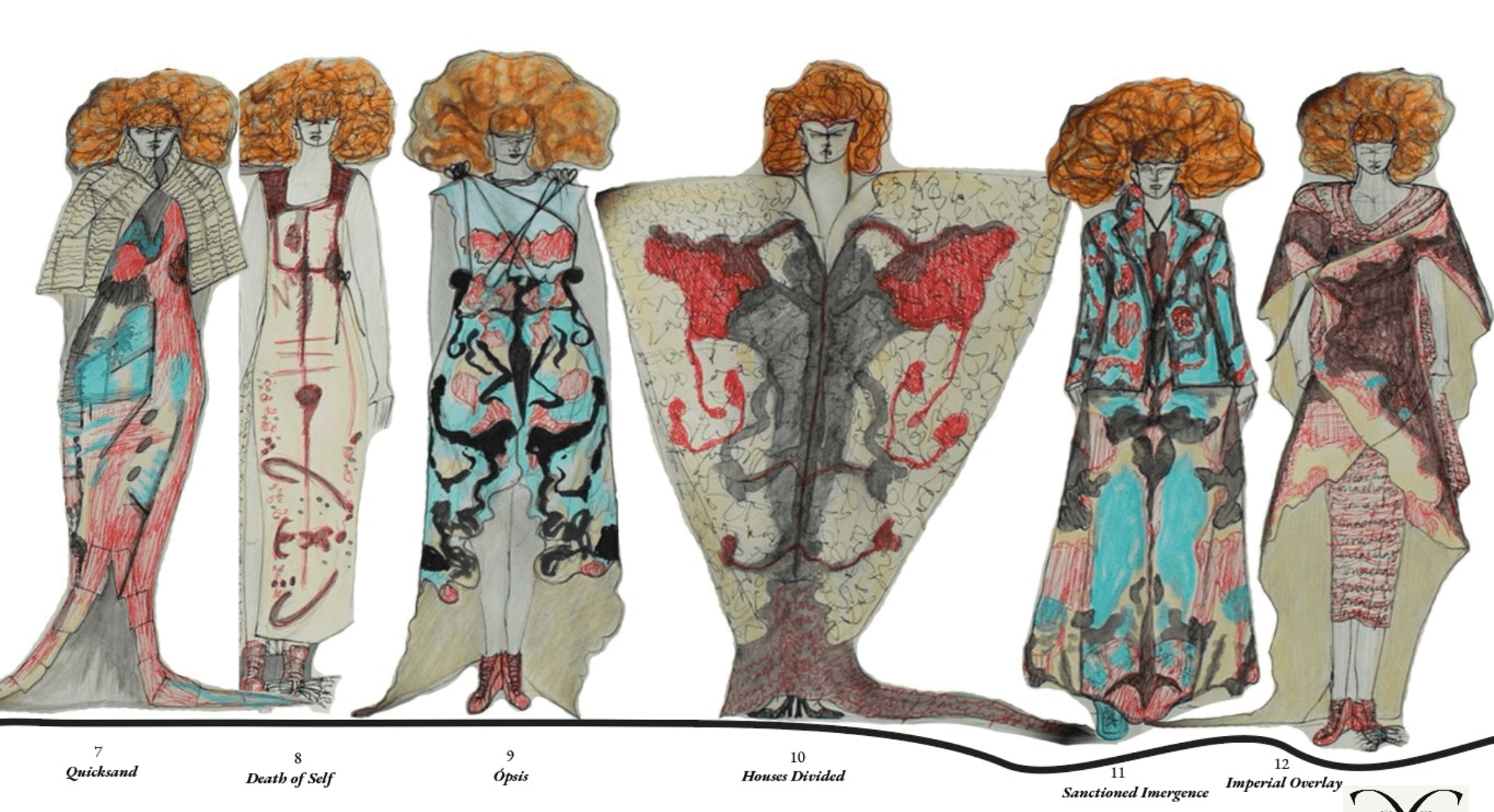
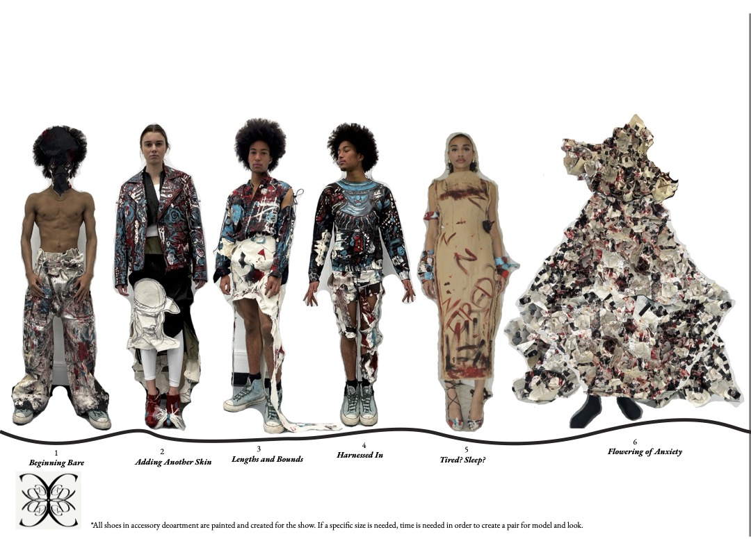
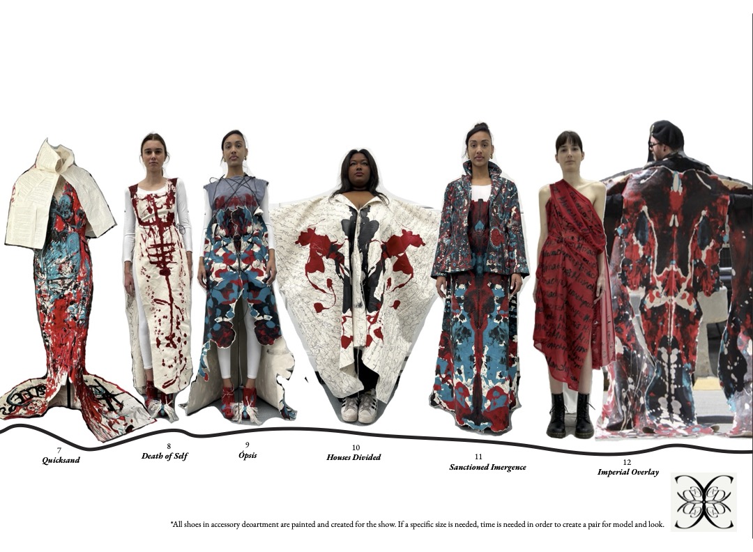
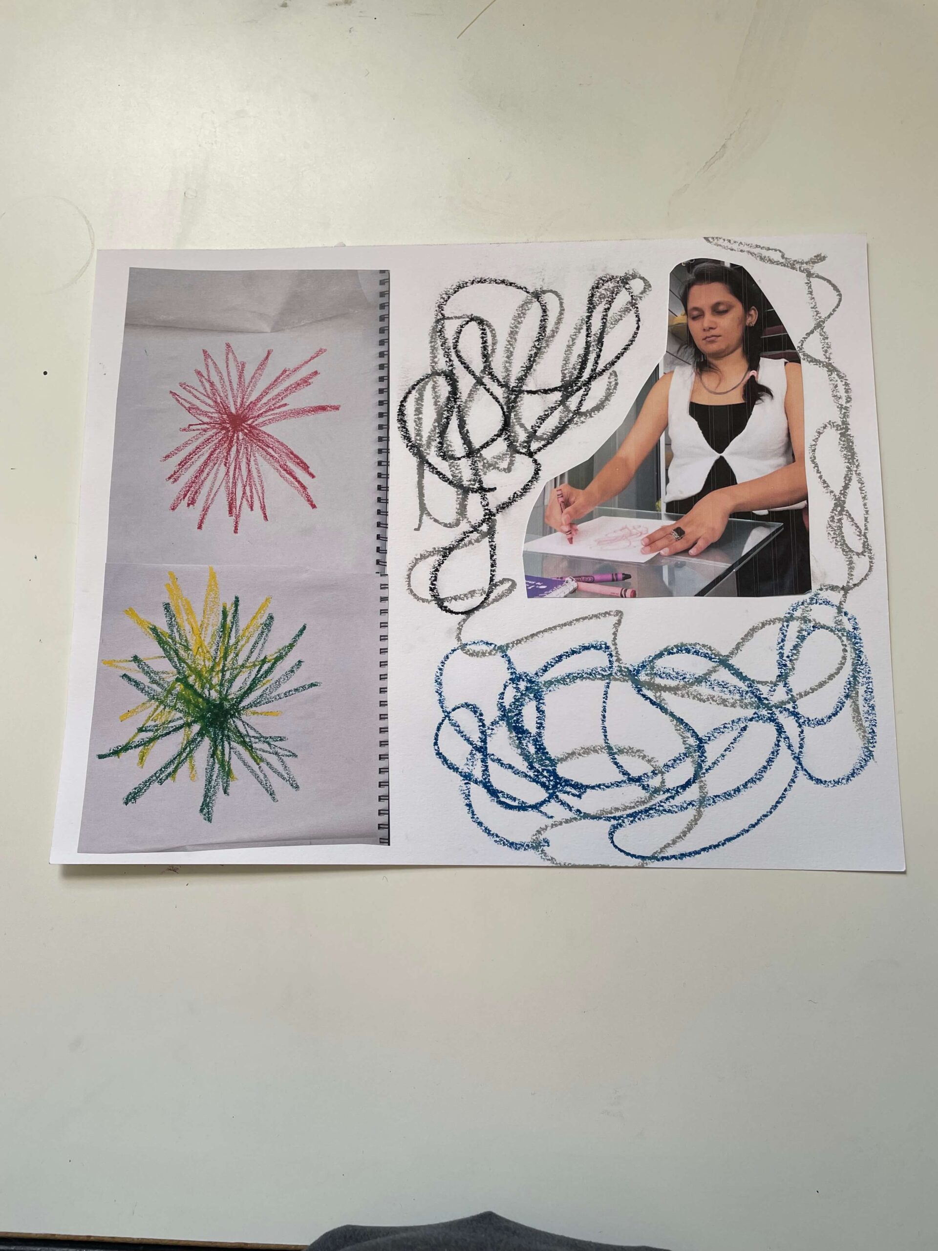
MFA Fashion Designer Chase Duval-Champagne emphasizes the importance of classical art training and a fusion of art and fashion in their thesis collection. Throughout their creative journey, Chase engaged in a diverse range of artistic pursuits that include photography, poetry, painting and drawing, interior design and restoration, landscaping, oral arrangements, and more. Explaining their concept and artistry, they shared: “An intriguing exploration, a chaos story in fashion, art, and neurodiversity, this collection of wearable art displays a range of striking formats, intricately depicting the journey of a neurodivergent individual grappling with anxiety within the creative realm. Each piece narrates a compelling story, intertwining aesthetic allure with profound emotional resonance, inviting viewers to engage with the complex nature of creativity and the challenges it entails especially for those who have a neurodivergence, all presented with an enchanting and puckish charm.” Chase’s creative process is enhanced through the use of unconventional materials, all stemming from the idea of “representing neurodivergence within the world and in the fashion industry.
Chase Duval-Champagne
MFA Fashion Design
Claudia Ayleen Nicholas
BFA Textile Design
BFA Fashion Designer Haemi Lee and BFA Textile Designer Claudia Ayleen Nicholas unite their beliefs for a collection named The Shape of God, aiming to represent the sublime nature of the Christian God.
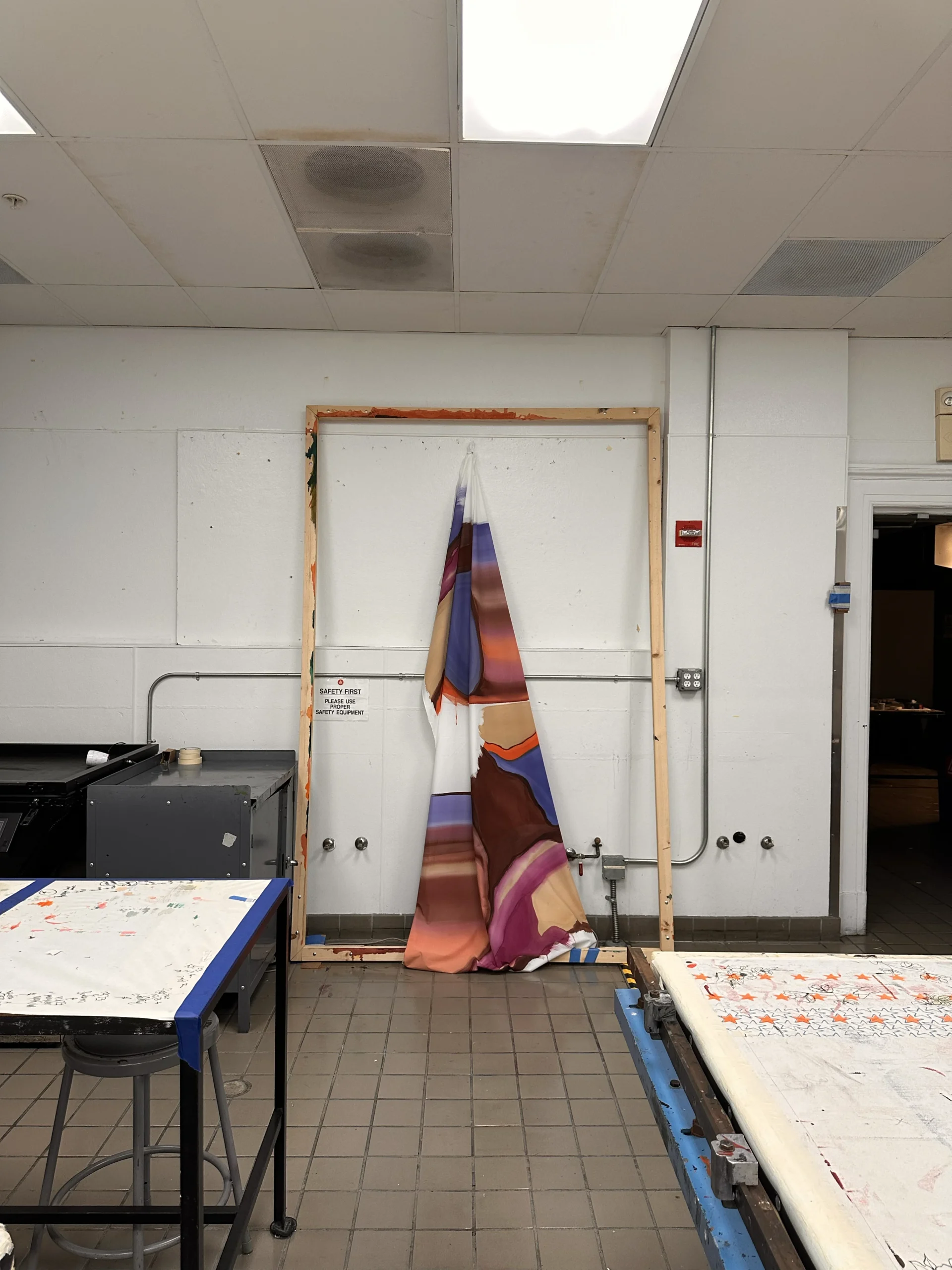
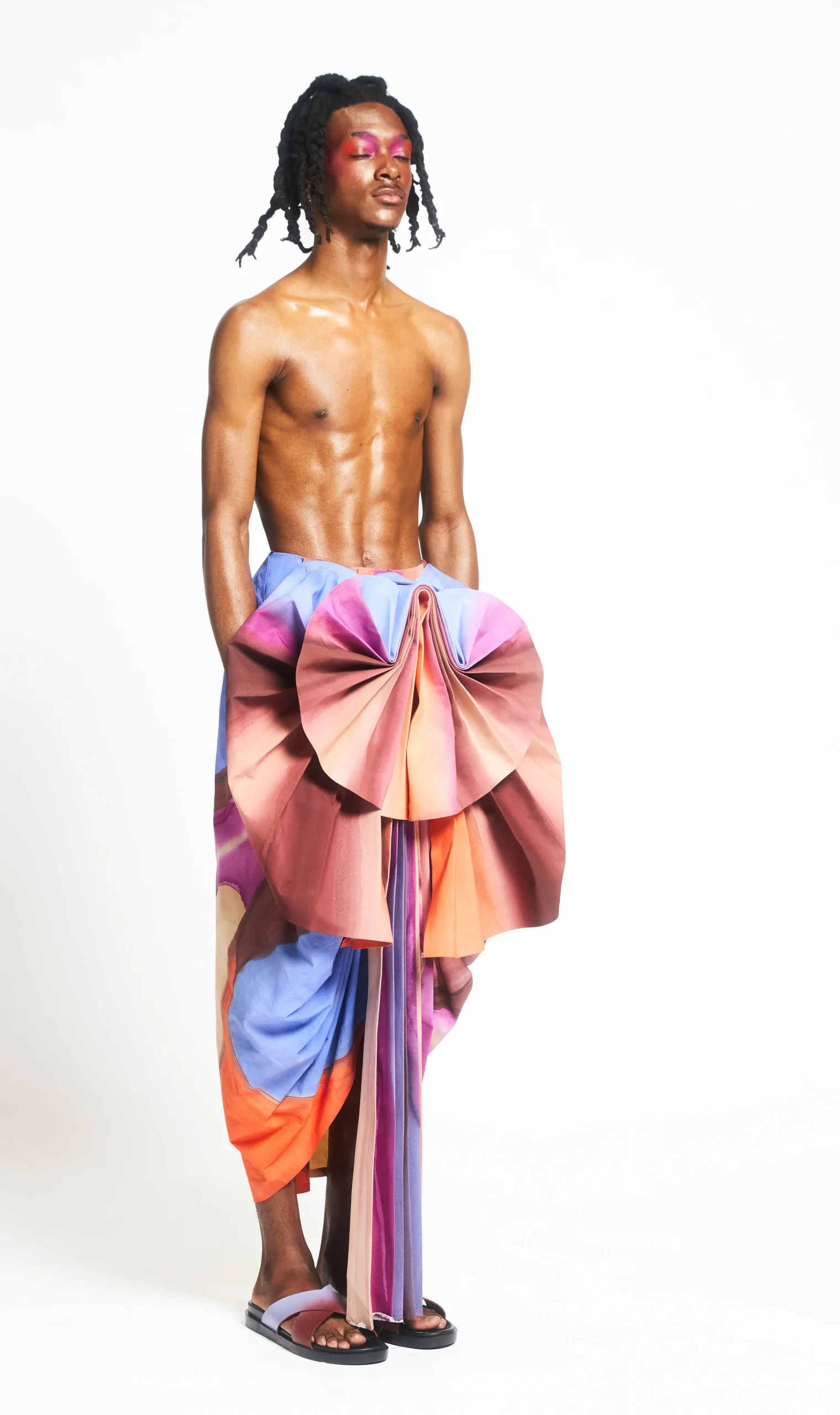
Taking visual inspiration from artist Susan Maddux, Haemi took pleated cotton and draped it over the human form, representing the infinite God – who transcends space, time, and reality. She chose to use cotton, framed as a common and affordable cloth, as the main fabric to represent the God’s humbleness, and used additional fabrics such as lame to also showcase His divine nature. All the fabric is hand painted by Ayleen, using Dye-Na-Flow Colors sponsored by Jacquard Products. Each piece was created as an abstract painting that is then folded into clothing. Haemi explained the overall feel of the collection less like clothing and more like walking pieces of art. Ayleen’s creative process is deeply personal. She doesn’t always begin with a clear plan or sketch. Instead, she lets her instincts guide her. This approach has grown even stronger through this collaborative project. “Working with Haemi has been such a blessing,” she says. “She’s patient, supportive, and also a Christian, so we understand each other on a deeper level. It feels like we’re creating something meaningful together.”
Claudia Ayleen Nicholas BFA Textile Design
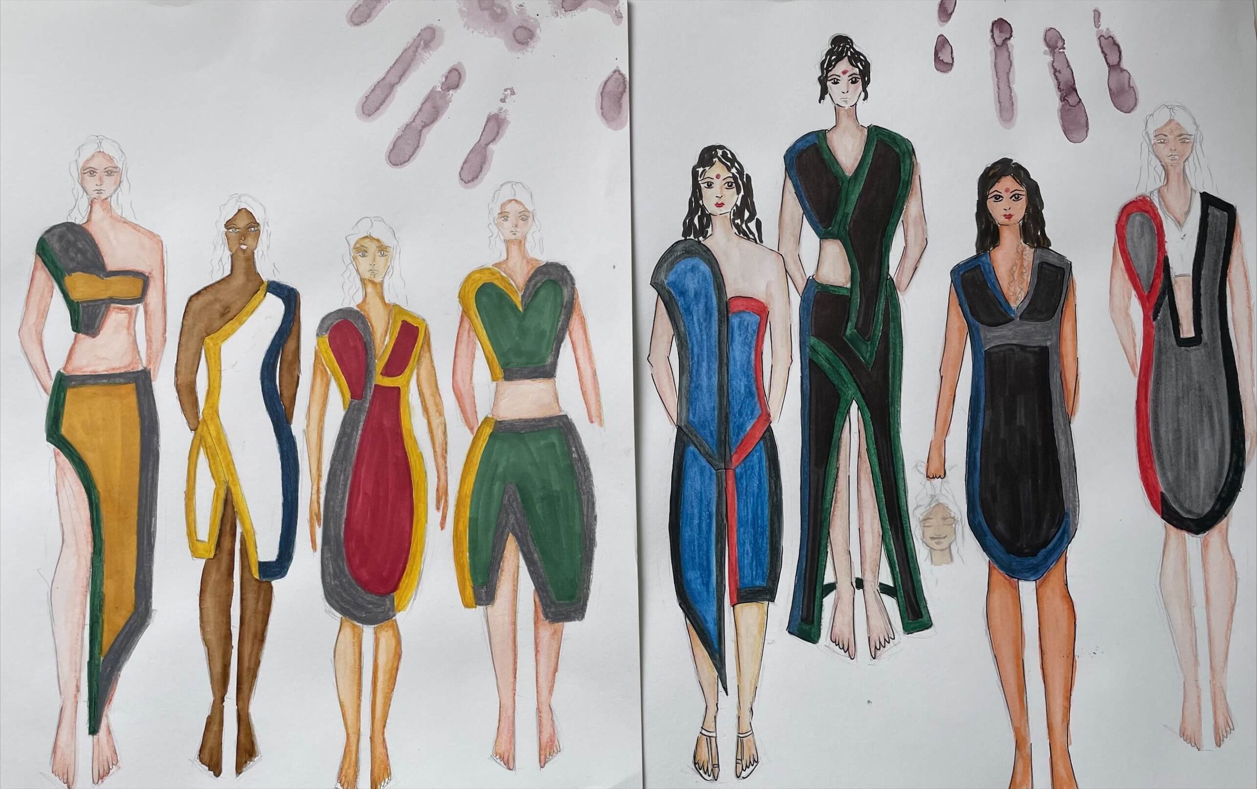
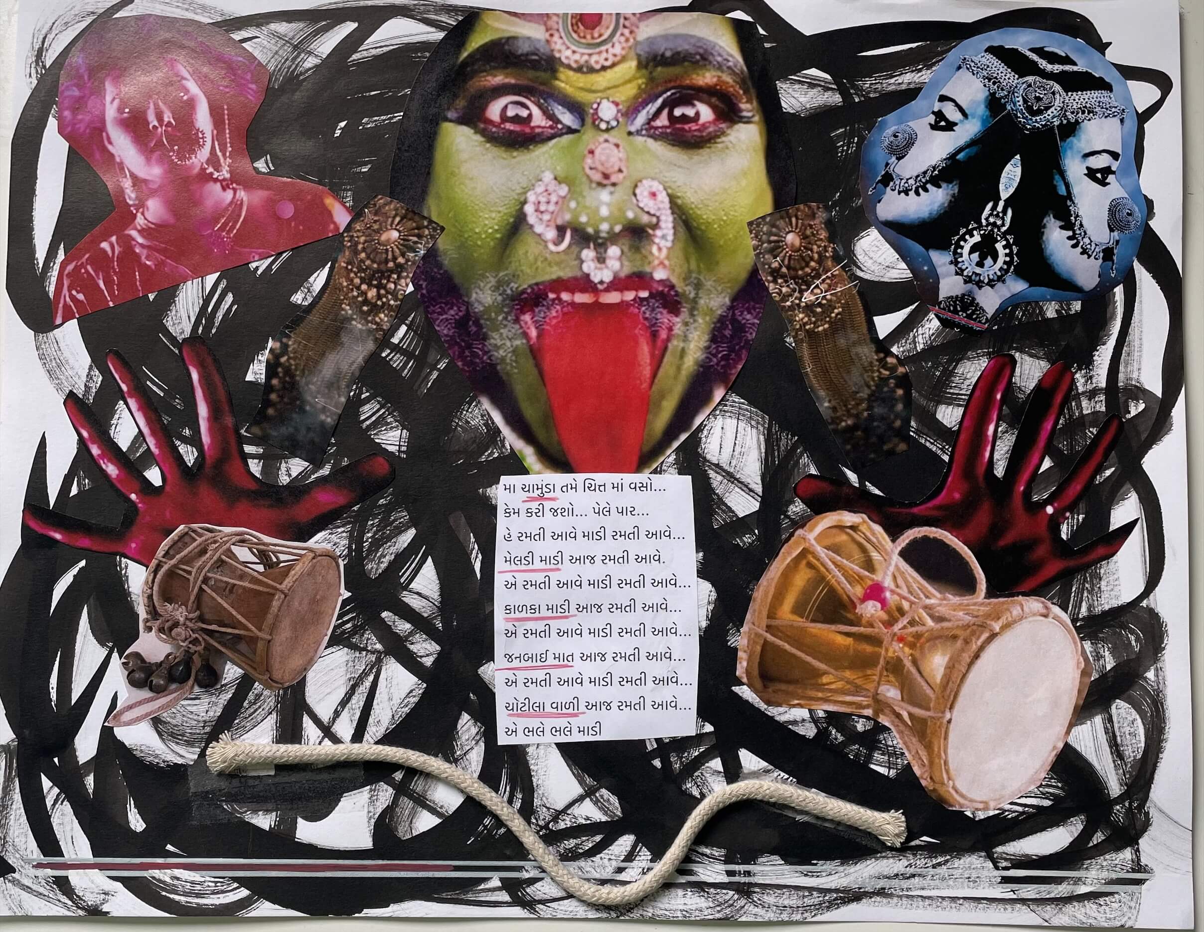
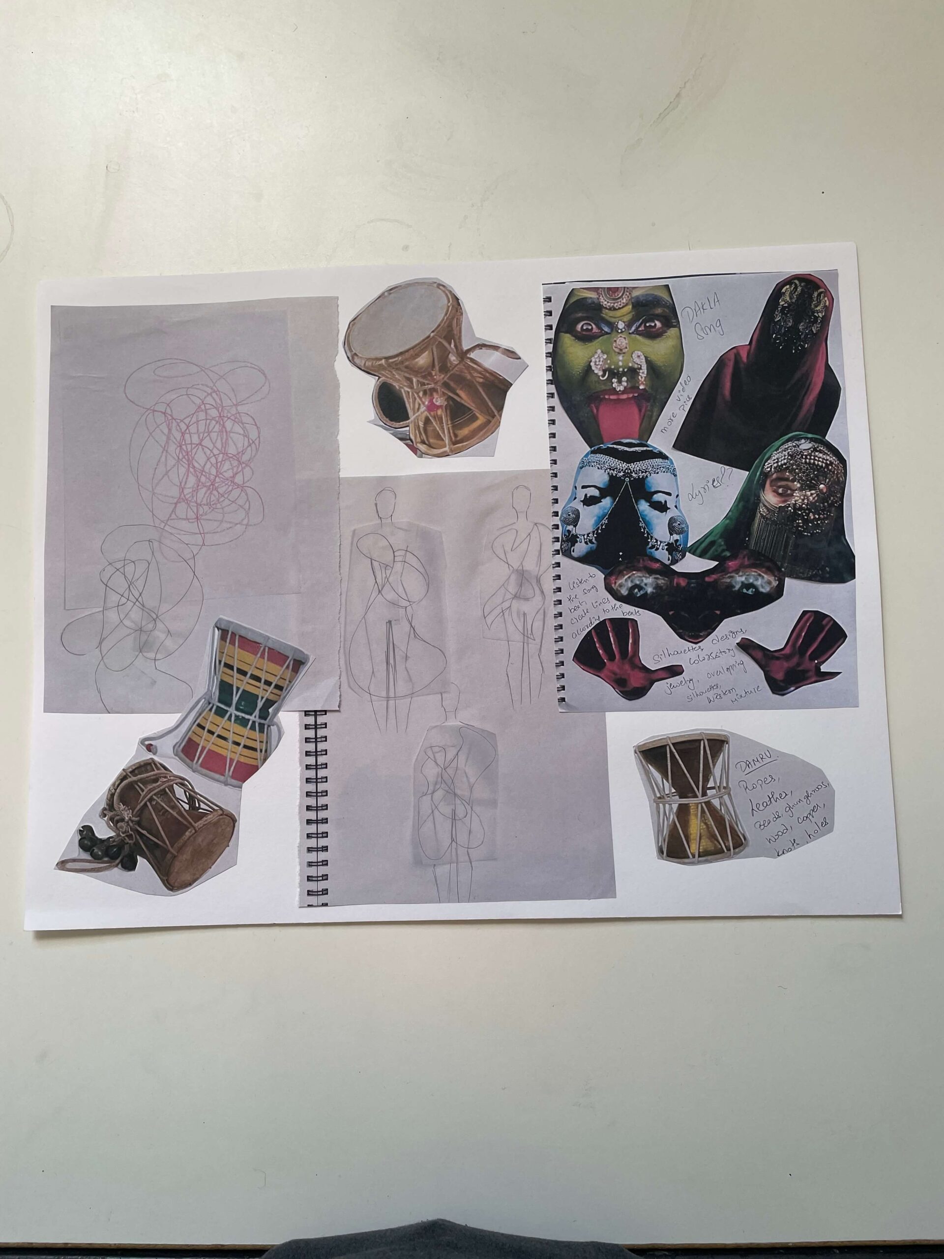
Devashree Jhaveri
BFA Fashion Design
A unique aspect of having a different background is the opportunity to discover a rich culture.
Devashree Jhaveri, B.F.A. Fashion Design, was born in Ahmedabad, Gujarat, India, and was
raised by her mother, a textile collector. Growing up, she learned about textiles from her mother and now aspires to share her culture and elevate Indian textiles on a global stage.
Jhaveri’s collection explores her emotional connection with the spirit world. She drew inspiration from the song “DAKLA” by Bandish Projekt, which made her realize the depth of her connection to the piece. “Hearing the song takes me to a different place, where my mind and body dance with feelings of love, anger, happiness, sadness, and so much more,” explained Jhaveri.
Through her work, she aims to tell a story highlighting that every woman embodies the essence
of a goddess. To bring her inspiration to life, Jhaveri listened to the song repeatedly and let its beats guide her as she drew on the paper. Each line and painting emerged on the page, reflecting her imagination.
Her work focuses on sustainability. Most of her designs utilize recycled mashru fabrics that her
mother collected in India. “In ancient times, mothers gifted blankets made from mashru to
newborn babies because it was soft and satiny,” said Jhaveri. The collection of mashru fabrics features a silky front and a cotton back, with each side displaying a different color that Jhaveri primarily selected, including green, yellow, blue, and red, expressing her emotions.
Devashree Jhaveri BFA Fashion Design
Dominic Godina
BFA Knitwear Design
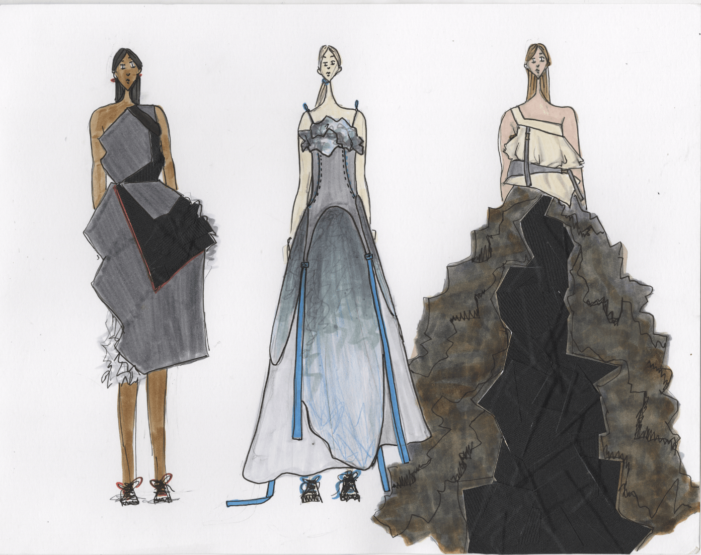
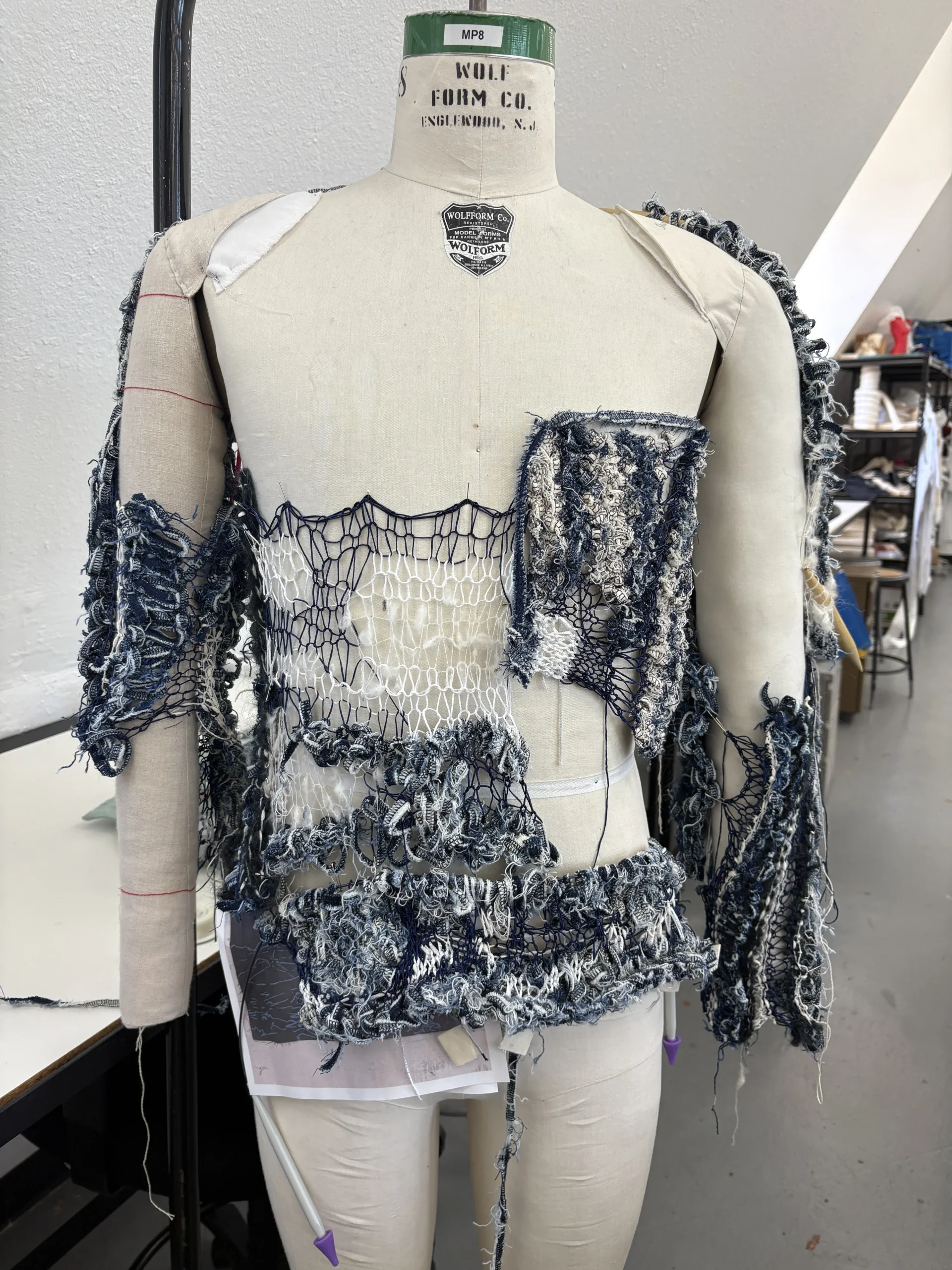
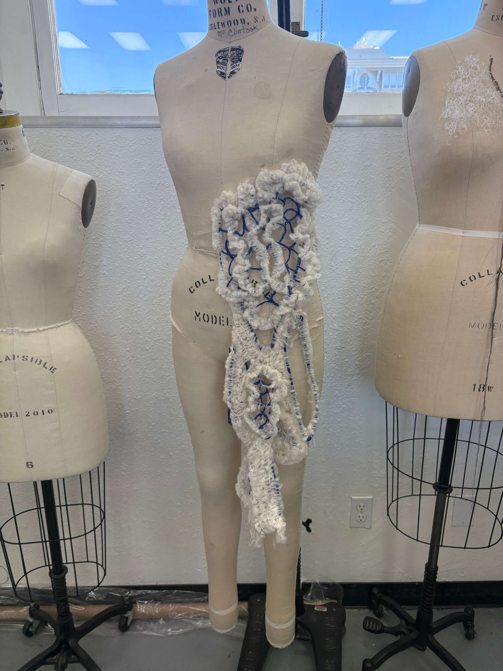
BFA Knitwear designer Dominic Godina combines knit and crochet craftmanship as a skillful approach to textile design. His collection “Memory of the Waters” celebrates the feeling of being nurtured when connecting with nature. Moss, wisteria trees, vines, and the ocean were the forefront of Dominic’s inspiration when creating his designs. In each look there are repetitions of patterns and textures to highlight nature’s amazing fractal structure. Living in San Francisco, he feels a special connection with nature he didn’t experience before in his life, and he felt inspired to translate this through his thesis.
When describing his unique approach, Dominic shared: “ I wanted the process of creating my collection to also have a connection to nature, so I put an emphasis on what our human hands can do. The majority of my garments is handmade by strategically crocheting each look right on the body which resulted in forms that cannot be replicated by machine, since before machinery we had our hands.”
Dominic Godina
BFA Knitwear Design
Dongying
Jiang
BFA Fashion Design
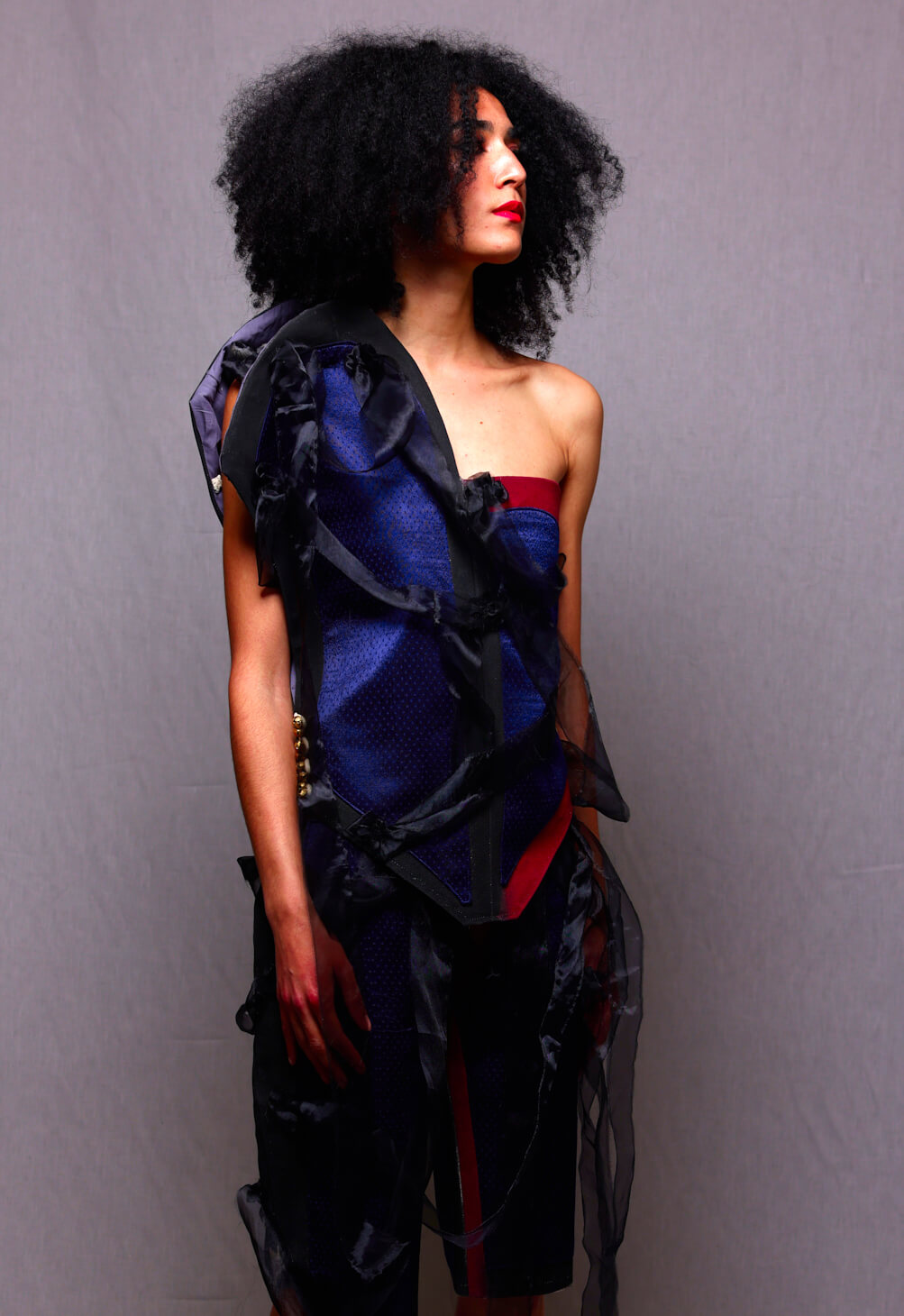
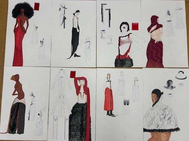
Abuse, verbal or otherwise, is not something that is easily explained to an outsider. One can say it is a very personal experience, one that no one should have to go through. Dongying Jiang, B.F.A. Fashion Design, uses her collection to give those who have suffered or are going through verbal abuse a voice and to truly evoke emotion in her viewers.
“The transparent fabrics symbolize fragility and exposure, which directly convey the sense of vulnerability of those who are verbally attacked,” explained Jiang. “When this happens, their weaknesses are exposed without any way to protect themselves.”
Her use of transparent fabrics on the outer layer of the silhouettes implies that, especially in vulnerability, there is still a need for protection. Her lightly saturated red inner linings provide internal coverage and protection for the victim. This component is also meant to illustrate that in the time of abuse, one’s internal emotions and personalities are exposed
Additional elements are the incorporation of Chinese shadow puppets and knots.
“Such a design integrates historical and cultural elements into modernity, highlighting the cultural background and the individual’s inner struggles,” shared Jiang.
Dongying
Jiang BFA Fashion Design
Emma Latham
BFA Fashion Design
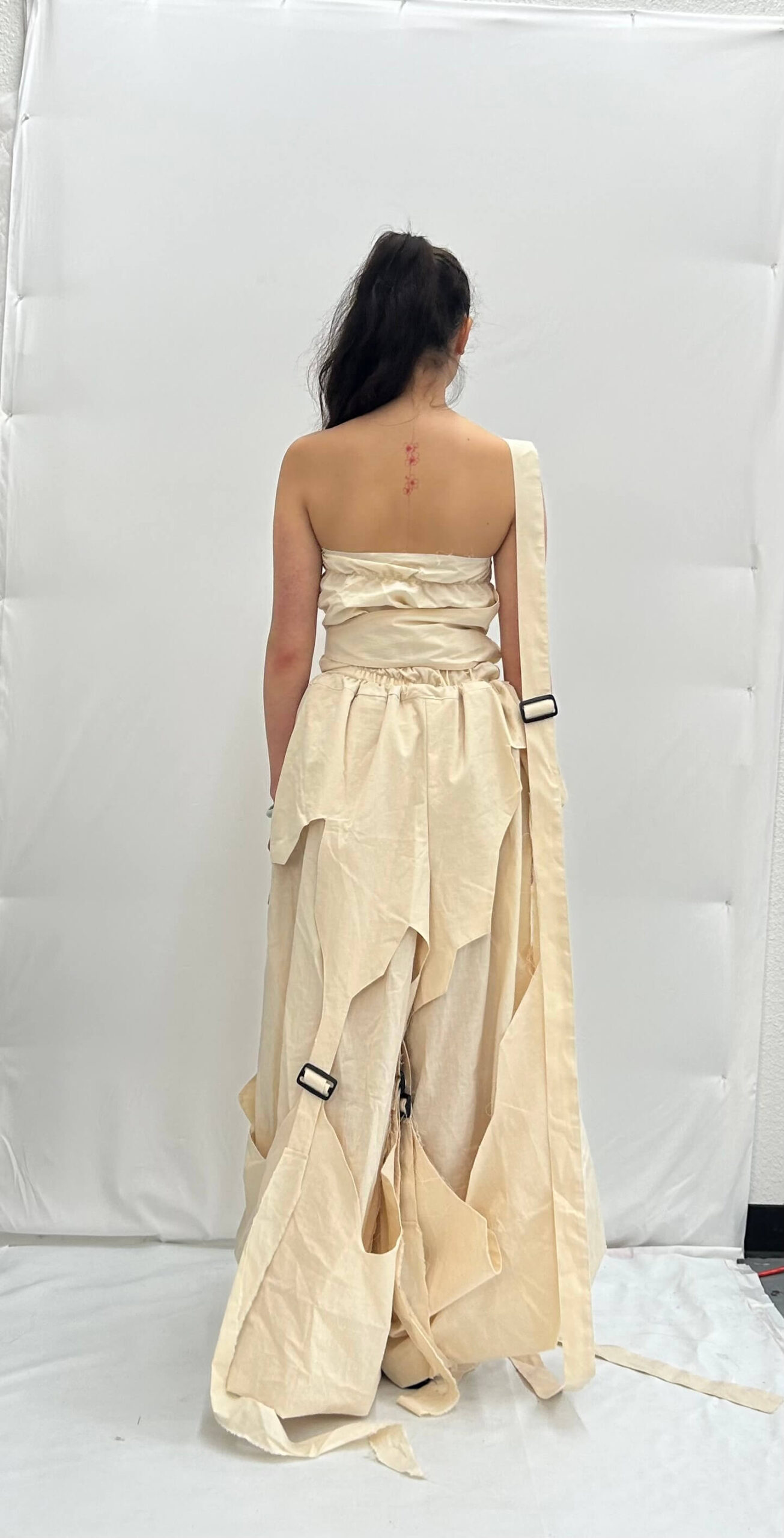
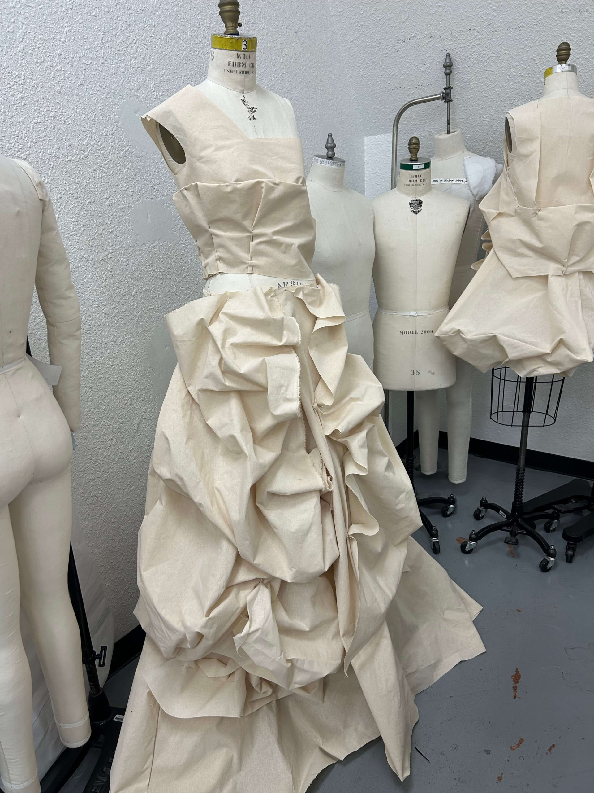
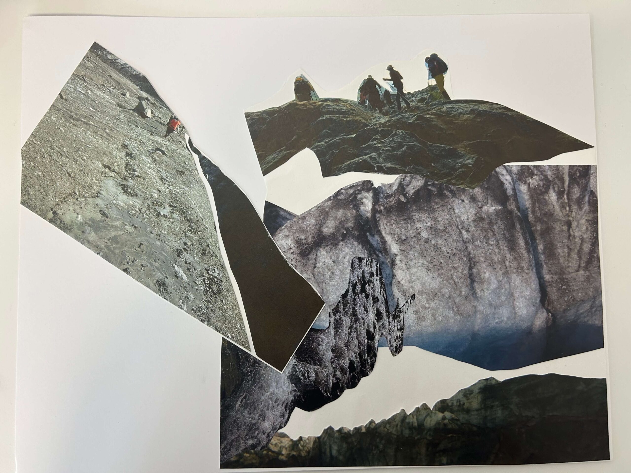
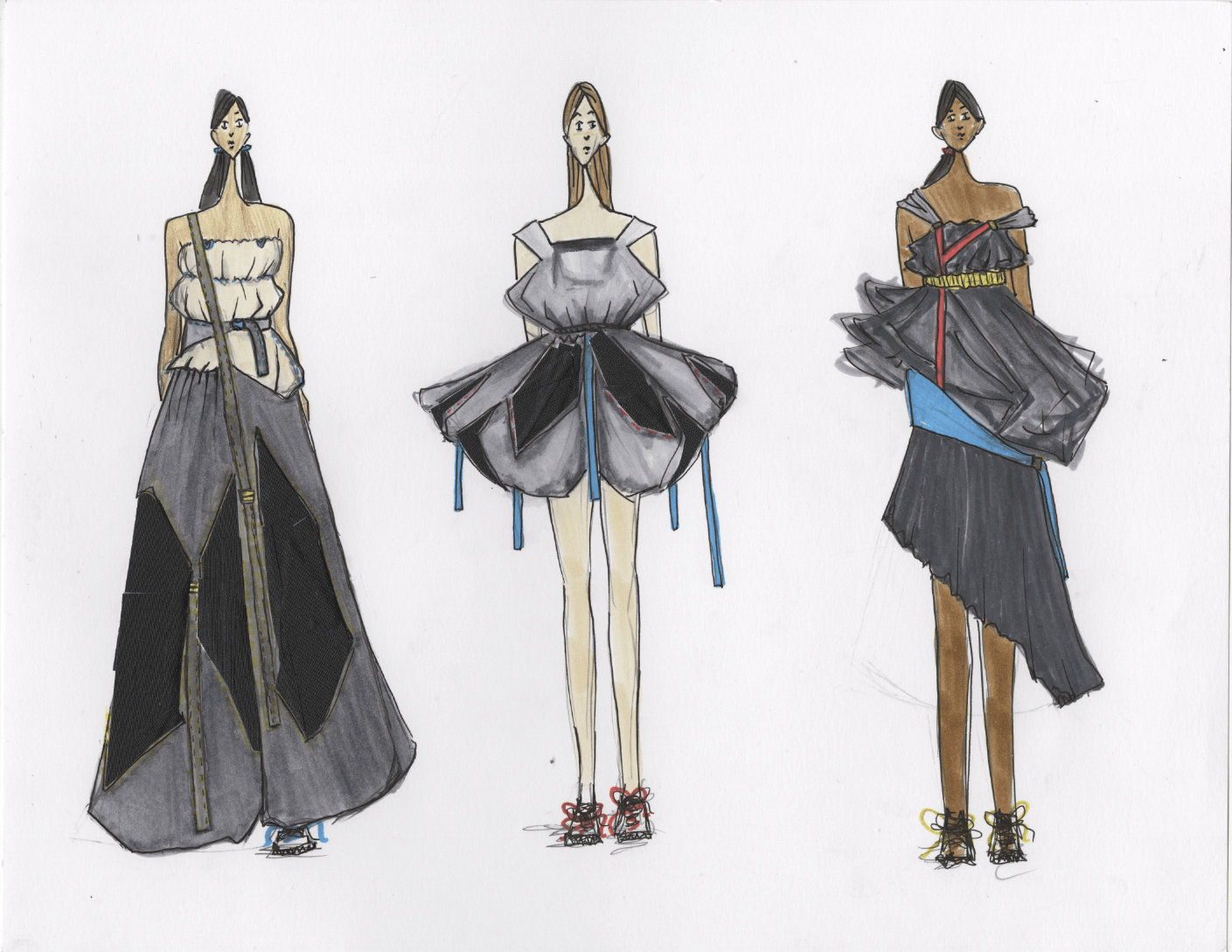
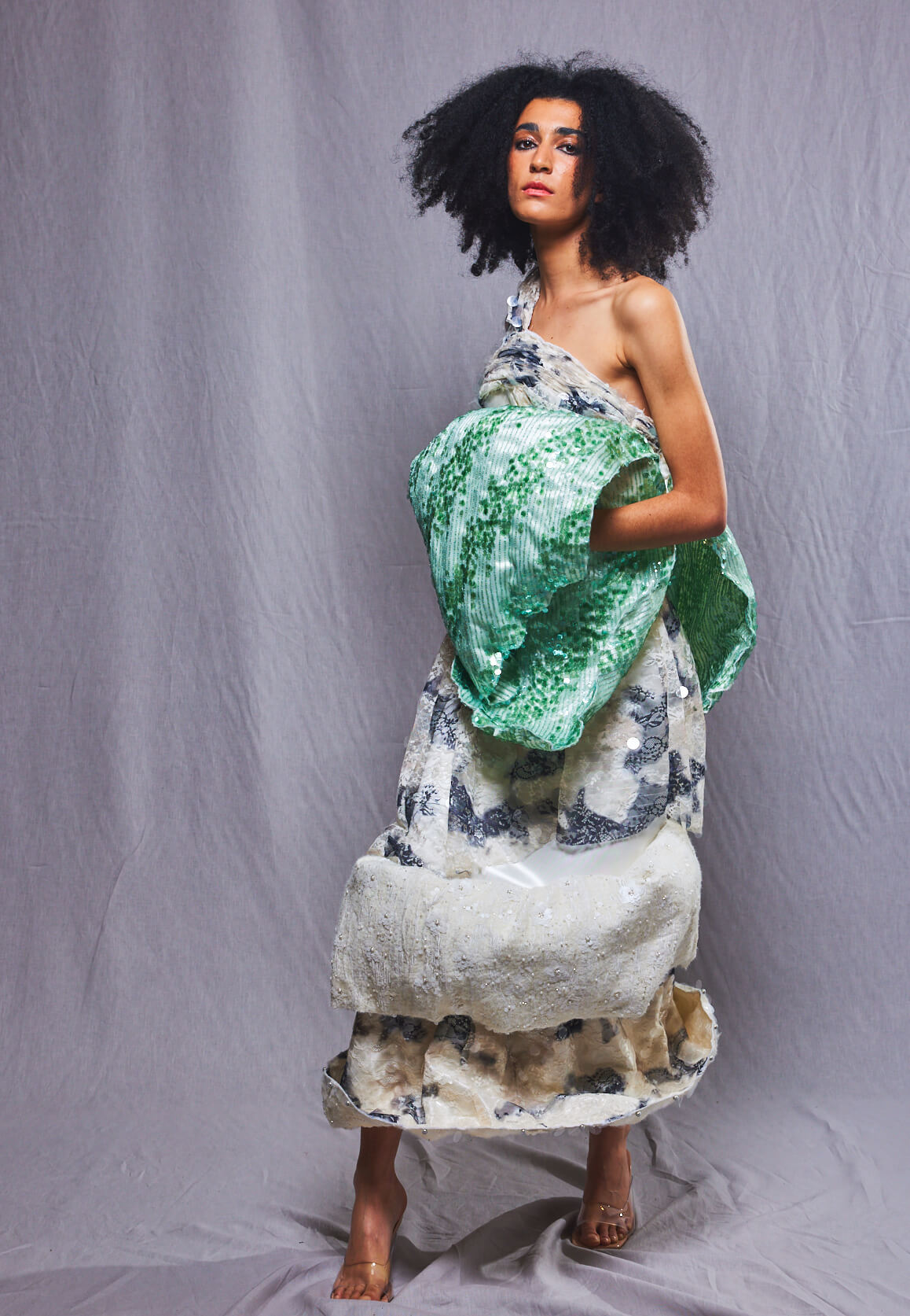
Inspired by Alaska’s rugged glacier terrain, B.F.A. Fashion Design student Emma Latham began her collection by purchasing a second-hand tent from Facebook Marketplace. She draped and cut the material onto a mannequin, using it as the foundation for a concept that soon took her into the Alaskan wild. “I knew what a glacier was, but never really knew what it would really look like up close,” said Latham. “I was really inspired by just the depth that the crevasses go for miles and miles and miles.”
Emma Latham BFA Fashion Design
Gigi Youngbauer
BFA Textile Design
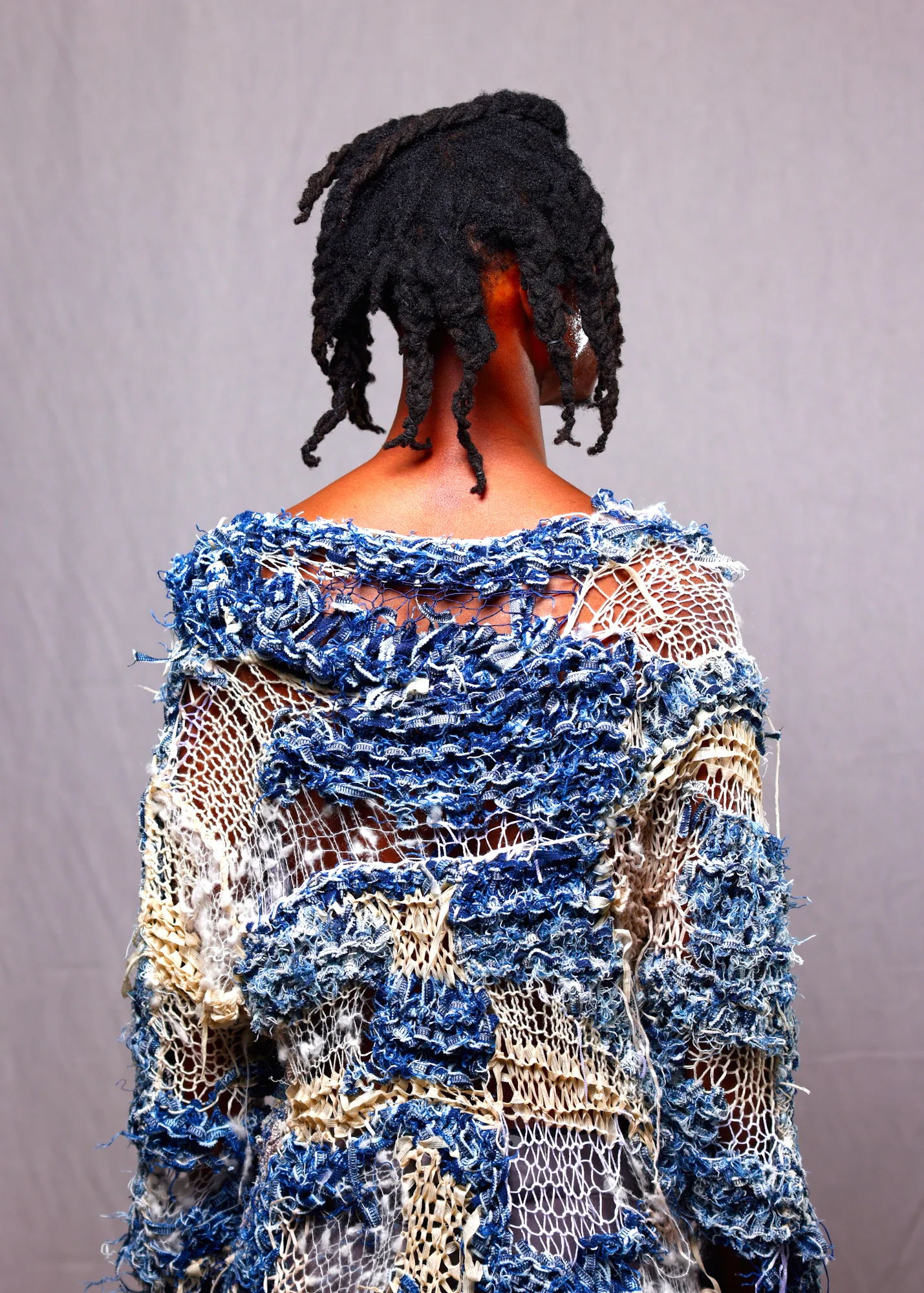
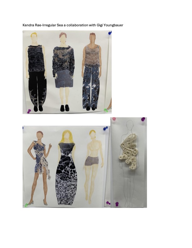
Biodegradable materials, recycled fibers, and 3D printing; not the typical elements you’d expect to see in a fashion show, but they came together perfectly for this oceanic collaborative collection, by Kendra Rae, BFA Fashion Design, and Gigi Youngbauer, BFA Textile Designer.
One of the more impressive and innovative parts of this collection is Kendra’s use of a newly publicly available biodegradable filament, a first of its kind. The collection is inspired by seafoam and rock formations found on beaches. Featuring seven looks, with a variety of unique silhouettes and equally distinct handiwork, just like waves or incoming tides, each piece is different and offbeat in its compelling way.
Exemplifying her proficiency in the breadth and depth of textile and yarnwork, the textile design collaborator Gigi Youngbauer’s fully handmade two-piece summer ensemble is a complex and detailed feat of her abilities.
In designers’ collaborative looks, we will see custom-printed designs on modest silhouettes, interesting and original takes on traditional garments, and a distinctly noteworthy dress, highly reminiscent of seafoam, all in neutral shades and deep oceanic blues. A shared feeling during this process was an appreciation for the metaphorical meaning of the ocean in this collection. Both an inspiration artistically, and a representation of life ebbing and flowing, with their time in college coming to an end.
Gigi Youngbauer BFA Textile Design
Haemi Lee
BFA Fashion Design
BFA Fashion Designer Haemi Lee and BFA Textile Designer Claudia Ayleen Nicholas unite their beliefs for a collection named The Shape of God, aiming to represent the sublime nature of the Christian God.
Taking visual inspiration from artist Susan Maddux, Haemi took pleated cotton and draped it over the human form, representing the infinite God – who transcends space, time, and reality. She chose to use cotton, framed as a common and affordable cloth, as the main fabric to represent the God’s humbleness, and used additional fabrics such as lame to also showcase His divine nature. All the fabric is hand painted by Ayleen, using Dye-Na-Flow Colors sponsored by Jacquard Products. Each piece was created as an abstract painting that is then folded into clothing. Haemi explained the overall feel of the collection less like clothing and more like walking pieces of art. Ayleen’s creative process is deeply personal. She doesn’t always begin with a clear plan or sketch. Instead, she lets her instincts guide her. This approach has grown even stronger through this collaborative project. “Working with Haemi has been such a blessing,” she says. “She’s patient, supportive, and also a Christian, so we understand each other on a deeper level. It feels like we’re creating something meaningful together.”
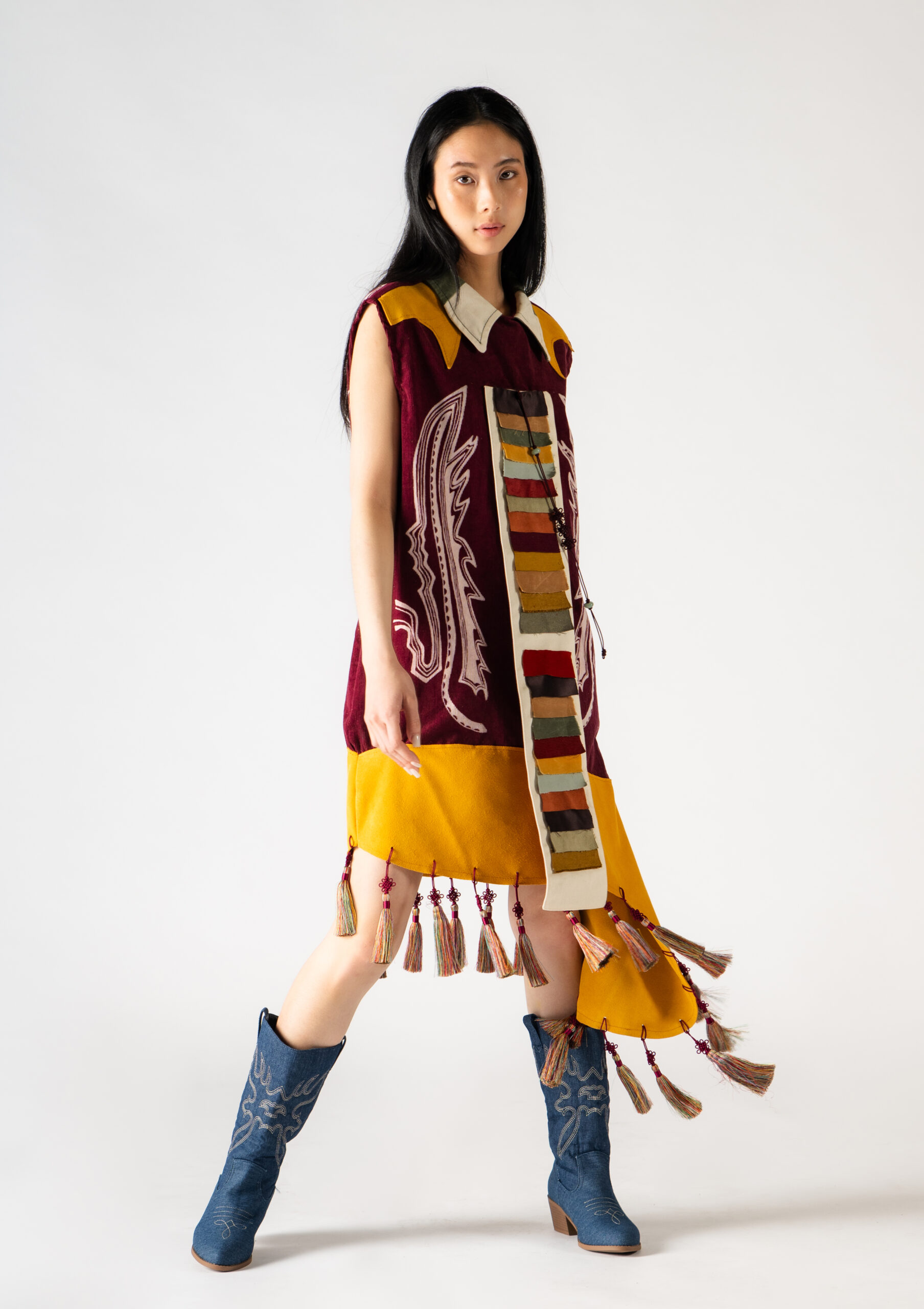
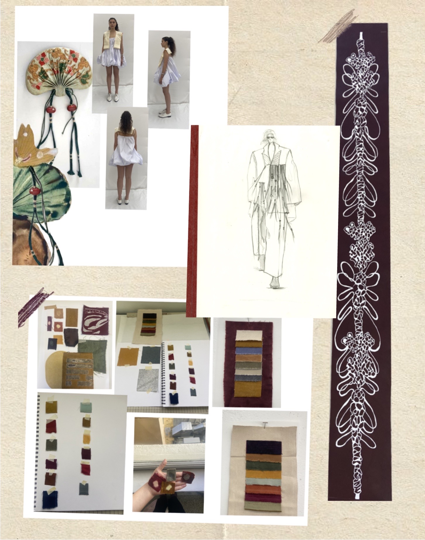
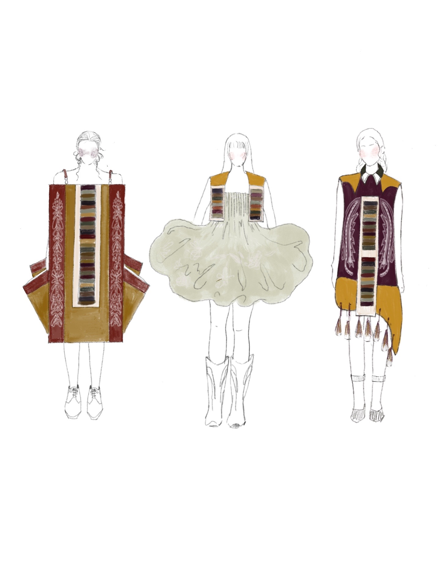
A fashion collection that is a blossom of cultures, Hannah Kim, B.F.A. Fashion Design, blends ‘60s and ‘70s San Francisco with her Korean heritage creating a unique mix of silhouettes and textiles.
Upon moving to San Francisco for college from Korea, Kim had an epiphany that served as inspiration for her thesis collection. “It was a trend to move to California for all the young people,” said Kim. “I resonated with it. It felt like I was one of those ‘60s hippies.” Parallels meet with her inspiration with the bokjumeoni, a coin bag purse, used in the Joseon Dynasty in Korea inspires the details for the tassels, knots, and shapes of the looks.
The city’s rich history of self-expression and the liveliness of its youth do not go unnoticed. Taking notice of objects and outfits seen on the street, Kim used the connection of the straps from both iconic hippie accessories/clothing, and bokjumeoni to thread the collection into one. Additionally, the bubble-like shape of the bag and the knots used to create the bokjumeoni, are used in her prints and silhouettes.
Prints are a significant detail for the designer. Drawn by hand, the prints are based on photos she took of her inspiration on the active streets of San Francisco. Using various methods, such as heat transfer, burnout, and silk screening, she created prints on different fabrics and textiles, adding an abstract essence to her garments. Kim expressed the vulnerable side of the process that motivates her. “Doing art—it doesn’t have an answer, you have to just trust yourself,” she explained. “No one will see the final result during your process; you’re the only person who knows this collection better than anyone else.”
Hannah Kim BFA Fashion Design
Kendra Rae
BFA Fashion Design
Biodegradable materials, recycled fibers, and 3D printing; not the typical elements you’d expect to see in a fashion show, but they came together perfectly for this oceanic collaborative collection, by Kendra Rae, BFA Fashion Design, and Gigi Youngbauer, BFA Textile Designer.
One of the more impressive and innovative parts of this collection is Kendra’s use of a newly publicly available biodegradable filament, a first of its kind. The collection is inspired by seafoam and rock formations found on beaches. Featuring seven looks, with a variety of unique silhouettes and equally distinct handiwork, just like waves or incoming tides, each piece is different and offbeat in its compelling way.
Exemplifying her proficiency in the breadth and depth of textile and yarnwork, the textile design collaborator Gigi Youngbauer’s fully handmade two-piece summer ensemble is a complex and detailed feat of her abilities.
In designers’ collaborative looks, we will see custom-printed designs on modest silhouettes, interesting and original takes on traditional garments, and a distinctly noteworthy dress, highly reminiscent of seafoam, all in neutral shades and deep oceanic blues. A shared feeling during this process was an appreciation for the metaphorical meaning of the ocean in this collection. Both an inspiration artistically, and a representation of life ebbing and flowing, with their time in college coming to an end.
Kendra Rae BFA Fashion Design
Kira Chen
BFA Fashion Design
Growing up, building relationships, and making connections were the most important aspects of
BFA Fashion Designer Kira Chen’s life. Born in Castro Valley, she was raised in a family that emphasized the significance of connection. Her final collection is inspired by Hong Kong film director Wong Kar-Wai’s Love
Trilogy and the concept of “Kizuna,” which translates to “the bond that connects us.” She drew
key inspiration from the films, as she felt deeply moved by the main characters and felt a parallel
connection to their lives. “Through my collection, I hope to showcase the raw emotions that arise from connecting with others and building relationships as we grow,” explained Chen.
To express her feelings through her garments, she primarily uses red and black colors to
symbolize femininity and love, incorporating materials such as satin, velvet, jersey, silk dupioni,
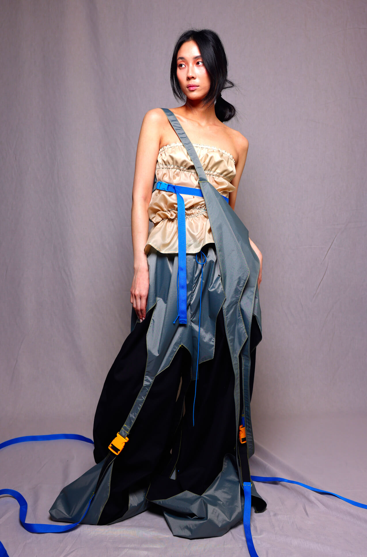
and repurposed plastic bags. The focus of her project is eco-consciousness and sustainability,
which she effectively brought to life by transforming takeout and grocery bags.
Chen pressed these bags together to create sheets with varying densities. Her garments symbolize confidence and self-assurance, showcasing skin and fostering a connection to others.
Kira Chen
BFA Fashion Design
Yujing Wang
Olivia Jabo
MFA Fashion Design
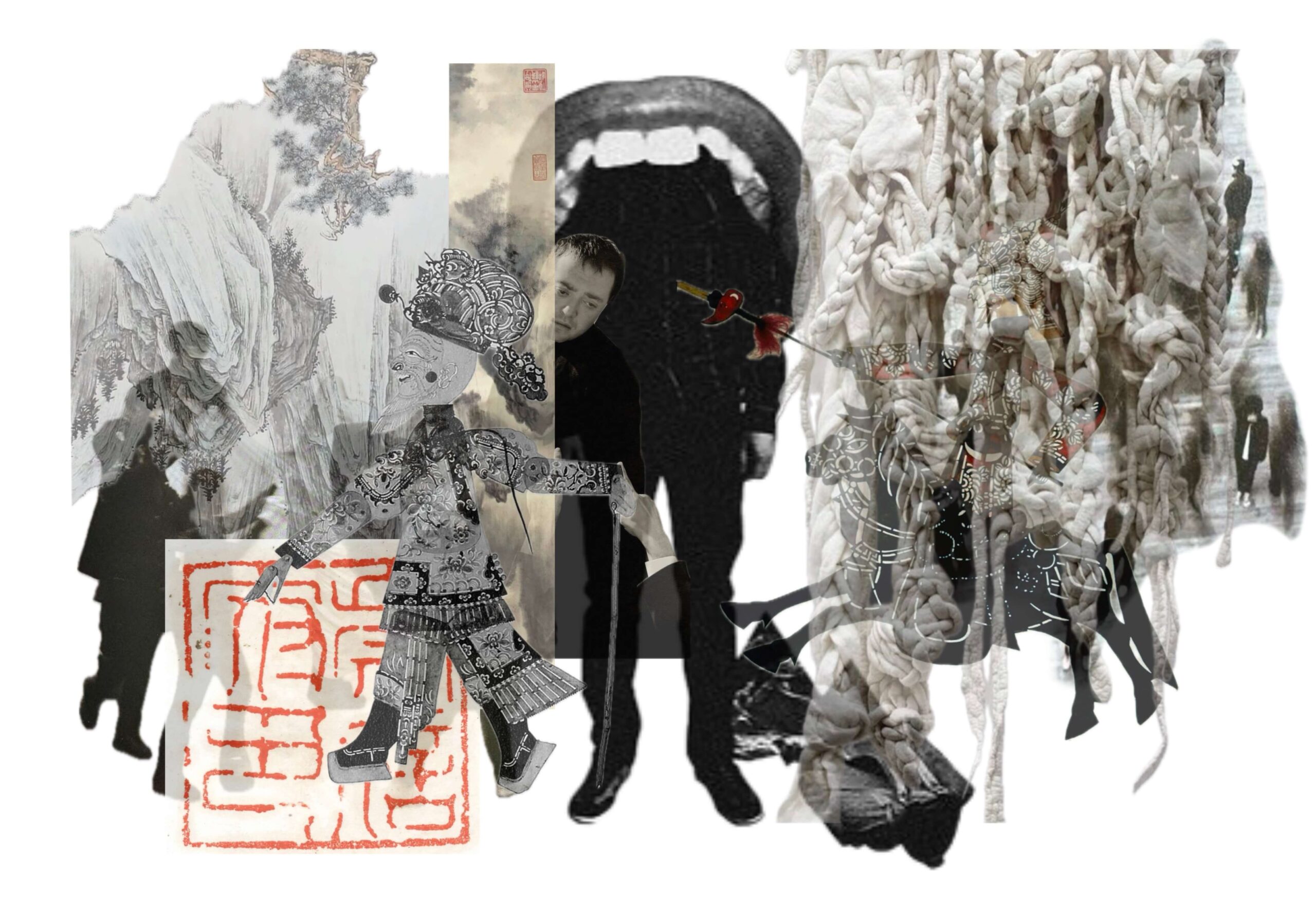
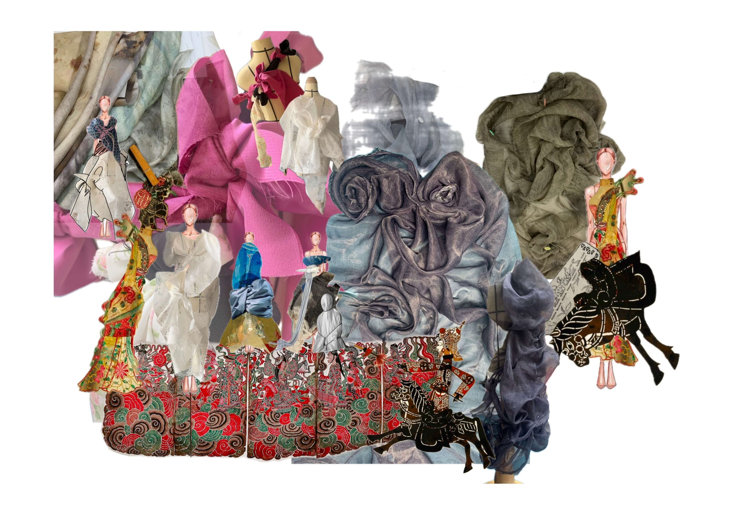
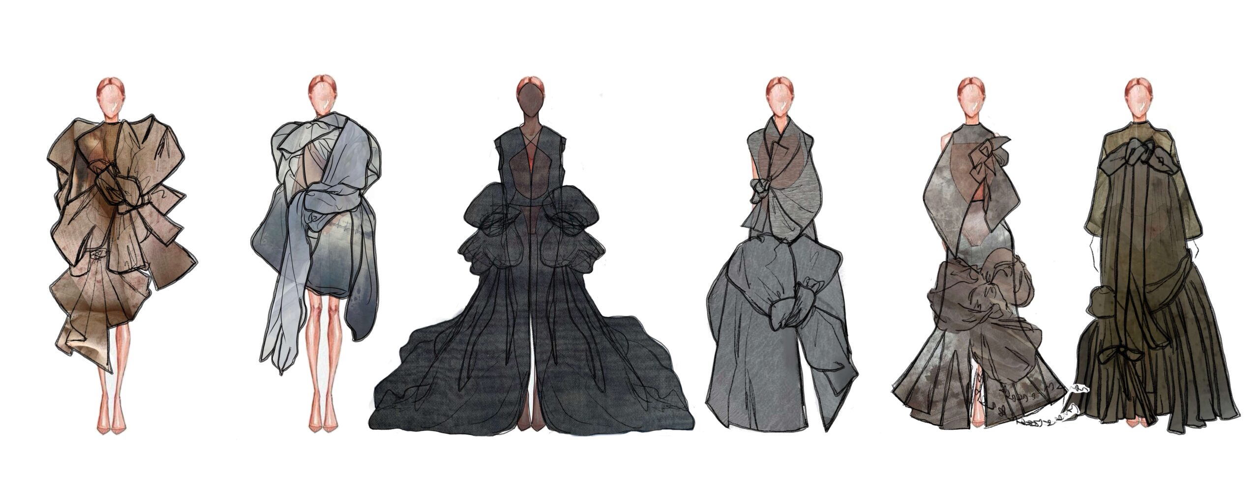
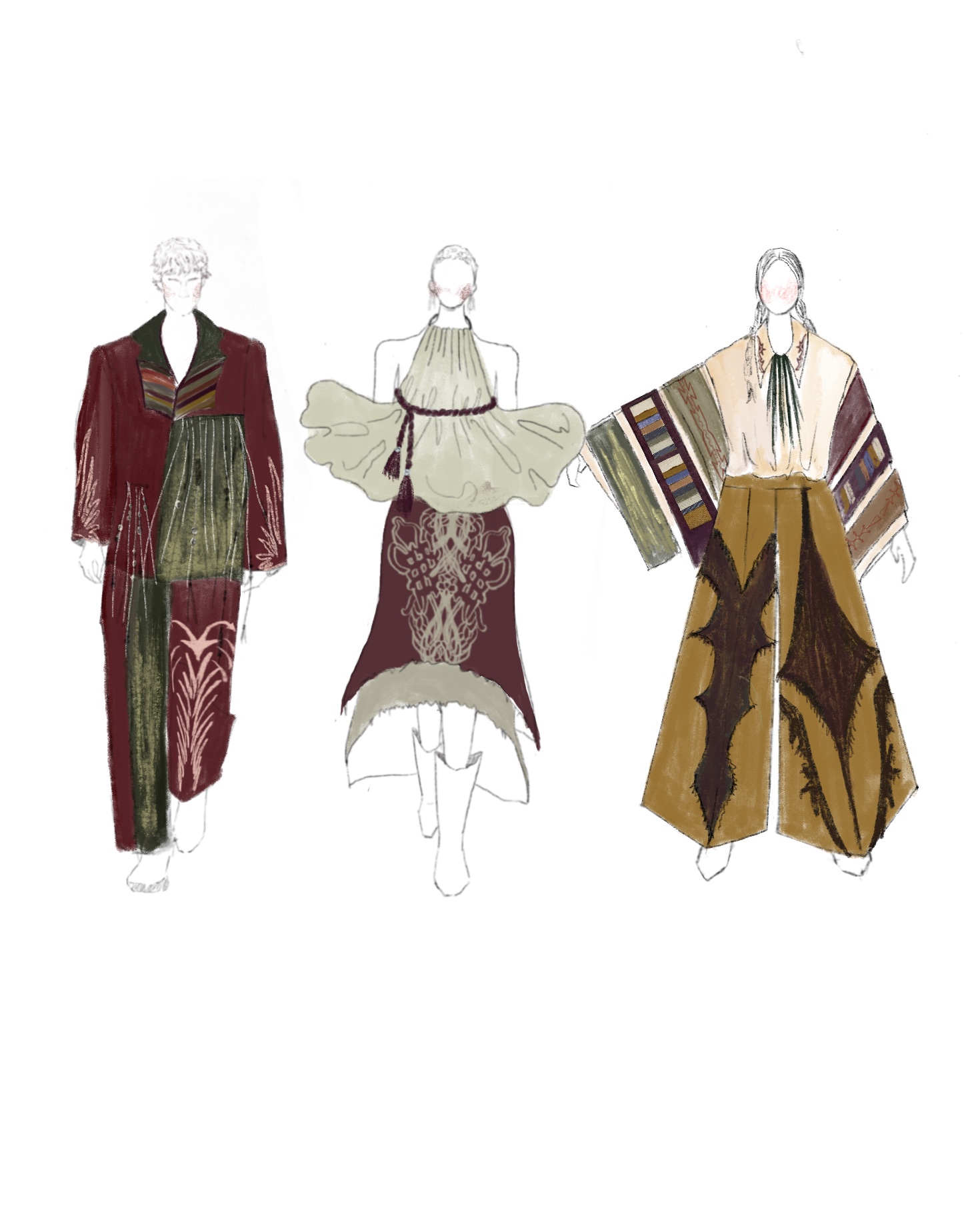
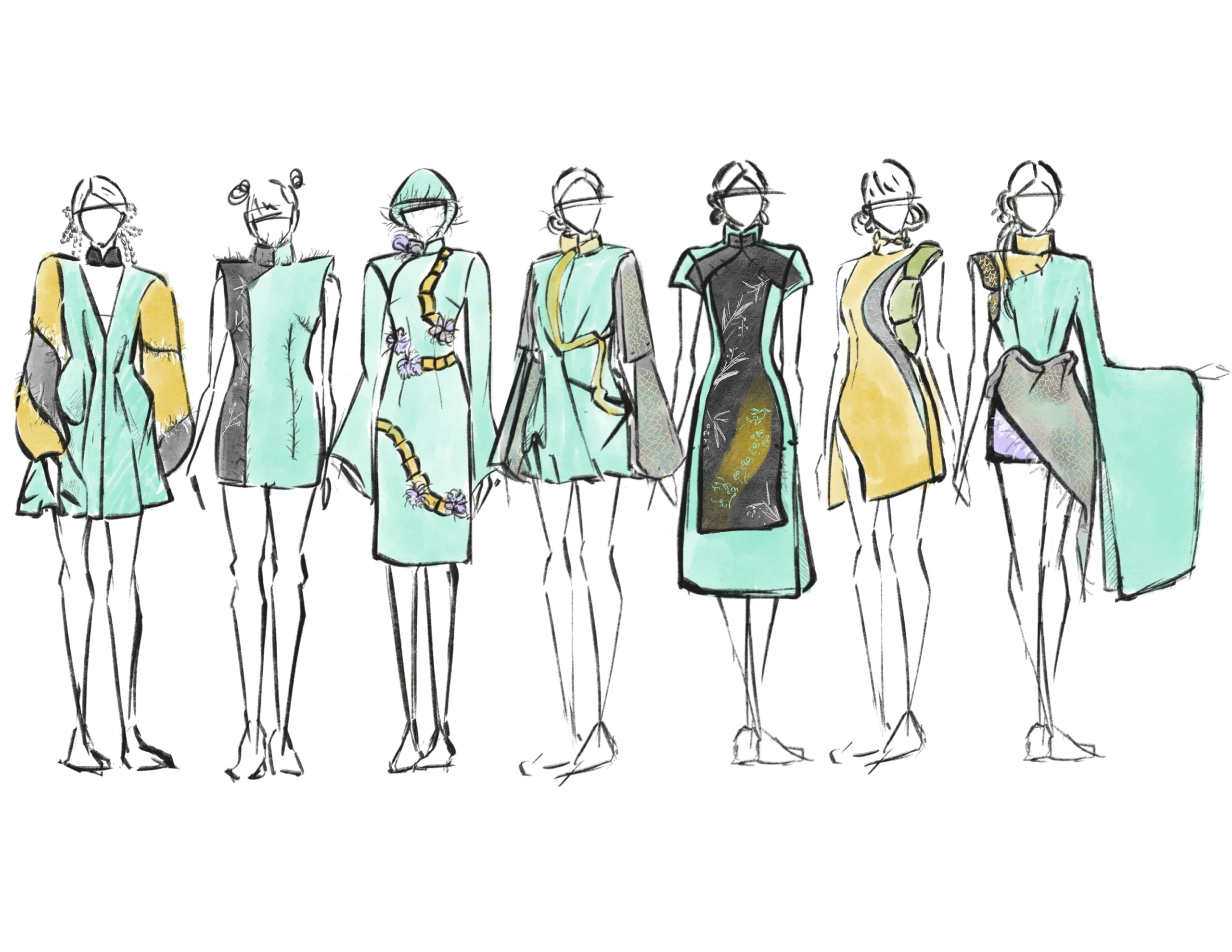
Born in Shaoxing, China, MFA Fashion Designer Yujing Wang mixes Chinese culture with elements of the self in her collection. Shanghai was a large source of inspiration for the designer, using old Shanghai style cheongsams as a base for her garments. “I personally love Chinese culture, and I love to watch how they use those Intangible Cultural Heritage techniques on social media,” shared Wang. “During my undergraduate years, I took a special class to learn about traditional Chinese clothing and the history of clothing in China.” Wang also implements the meaning of the self into her modernized qipaos, like the use of dragons to represent her zodiac sign and color palette inspired by her name’s meaning (Yu Jing means “Jade Well” in Chinese).
The designer experimented in her collection, using shadowplay and converting 3D shapes into 2D forms. “At the beginning, the shape of the dragon may be superficial, a very figurative dragon coiled in the costume, after continuous attempts to do the costume silhouette, from the silhouette or the use of the shape of the darts to continue to explore how to integrate the elements of the dragon into the design.” The traditional fabrics from China, such as silk dyed with Shoulang Yam called gambier Guangdong gauze and the delicately ornate Song brocade, and draping create the juxtaposition of elegant Chinese culture with novelty design.
Yujing Wang MFA Fashion Design
Martharine Anne
Olivia Jabo
MFA Fashion Design
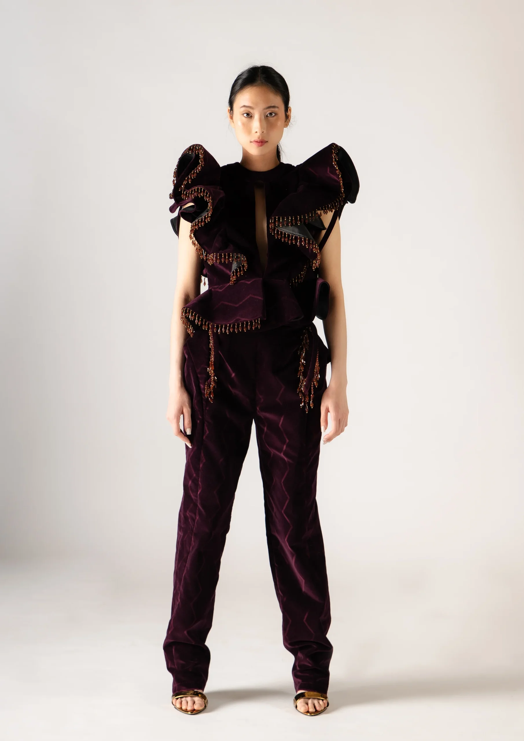
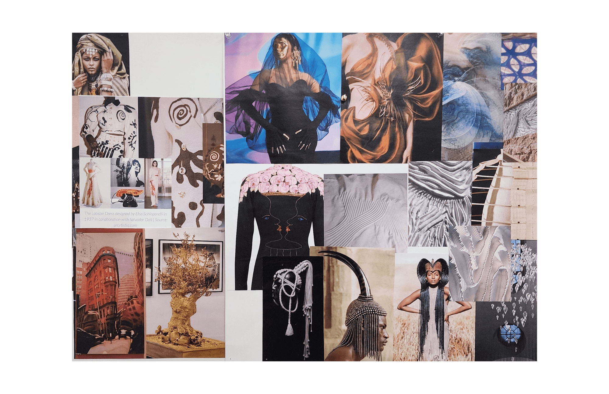
M.F.A. Fashion Designer Martharine Anne Olivia Jabo’s thesis collection, titled “URITHI,” which means Heritage in Swahili, embodies aspects of a rich African heritage fused with modern elements of design and premium craftsmanship. “Urithi” is a re-interpretation of African fashion and culture into contemporary fashion.
“This is a collection that’s a celebration of my cultural identity, a preservation of traditional African practices that showcases the uniqueness, beauty, and diversity of African fashion to a wider audience,” shared Jabo. “Some of the traditional elements included in the garments are beadwork, use of traditional African woven fabrics, fabric manipulation, silhouettes, as well as ancient beauty practices like the wearing of lip plates and body art techniques.”
As a way of preserving her African heritage and cultural practices, Jabo chose to use sustainable fabrics such as Asooke and Kente that were hand-woven from various parts of Africa, and the process of creating these fabrics involves the use of sustainable fibers as well as sustainable production techniques that have been used for centuries.
:“My collection embodies different unique design ethos and is a combination of several aspects of fashion such as millinery, tailoring, beading, corsetry, needlework among others that I have interpreted in my own way,” explained Jabo of her creative process and techniques. “In addition to that, I have explored textile fabrication through the use of gold paint and gold leaf that have both been applied delicately by hand.”
Martharine Anne Olivia Jabo MFA Fashion Design
Mel Lamore
MFA Fashion Design
MFA Fashion Designer Mel Lamore’s debut collection is quiet, raw, and deeply personal. Built around their own experience with depression, the work is fragile and held together by a thread, draped with softness, and often on the edge of unraveling.
“It’s like it’s falling apart at the seams,” shared Lamore. Their designs feature hand-made thread mesh, delicate finishes, and a color palette of whites, slate grays, and washed periwinkle. “It wasn’t about fabric quality, really,” they explained. “It was more about how it feels. Comfort is really important to me.”
Lamore doesn’t follow a clean, step-by-step process. “I work intuitively but also as a planner, and it’s a very chaotic process,” they said. Lamore sketched loosely, draped with paper, built things up and tore them down again. “I tried to just trust the process,” they said. “Every single step of the way, it was a surprise.”
Originally, Lamore thought of the project as an outlet. But the more time they spent with it, the more it transformed into something softer. “It really has become a love letter—not just to myself—but to something so many people experience,” said Lamore. If the collection were a person, Lamore isn’t sure who they’d be. “Oh gosh… I have no idea,” they laughed. And maybe that’s okay. The work isn’t about conclusions. It’s about process, presence, and letting softness speak.
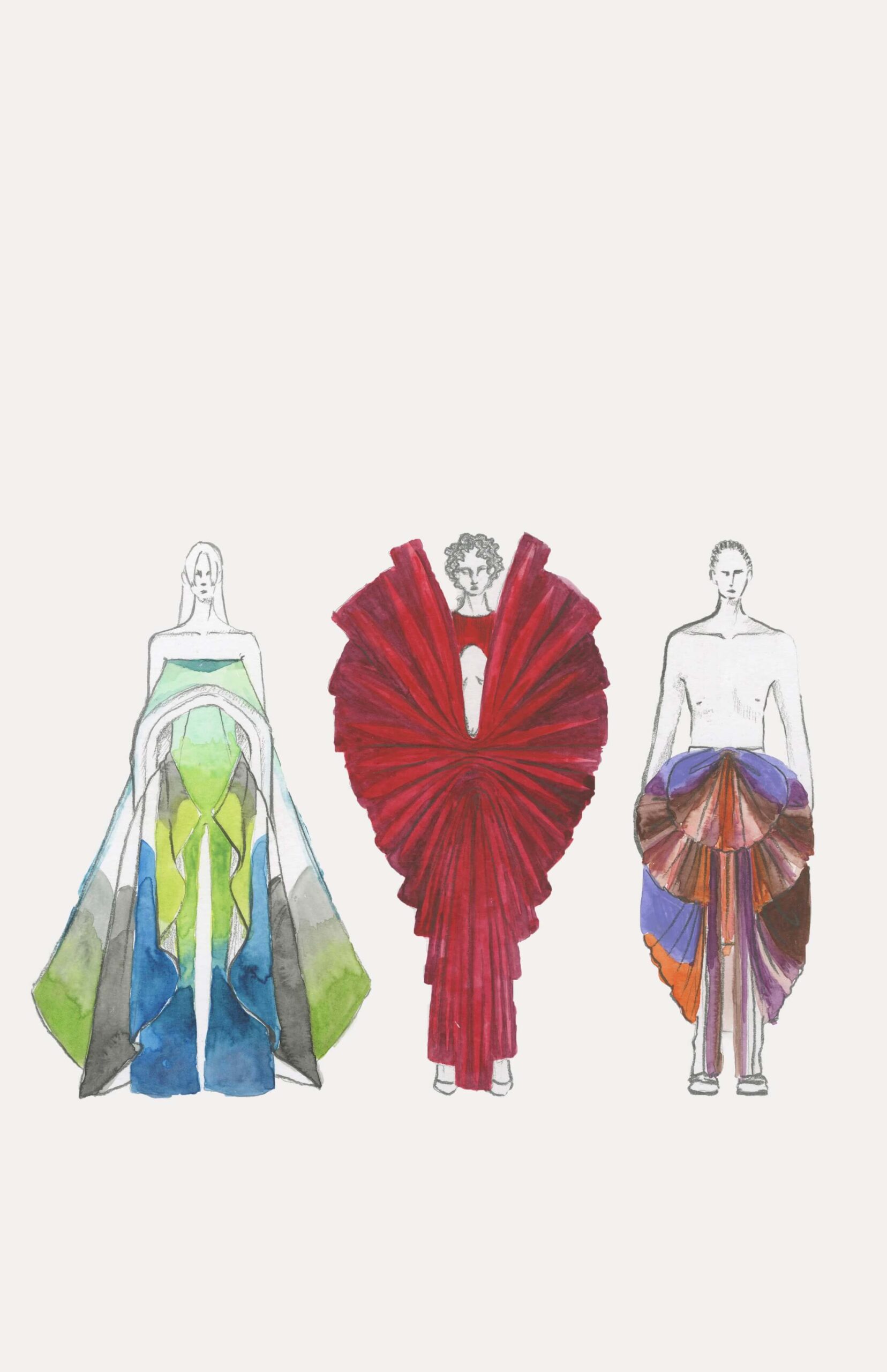
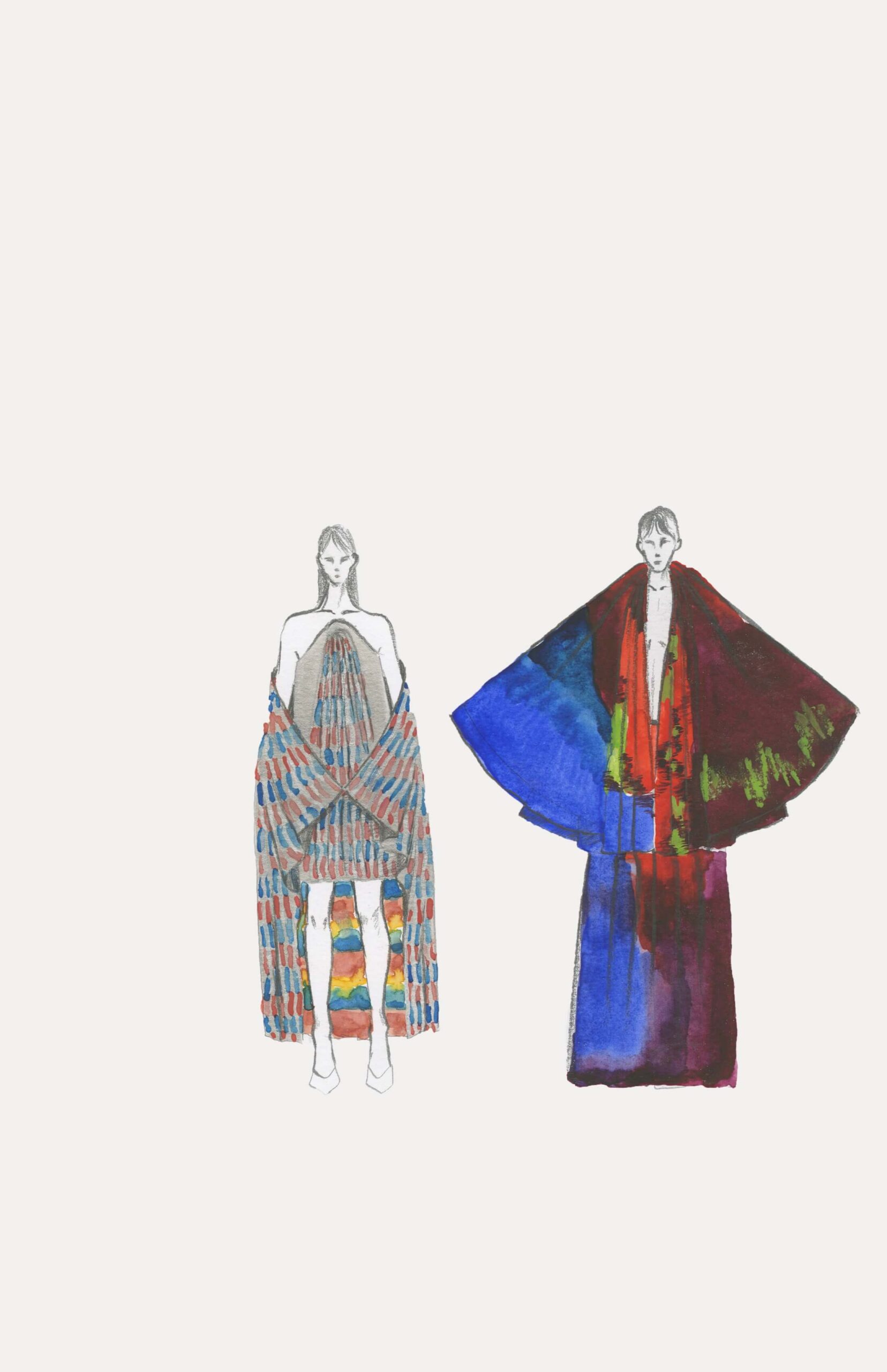
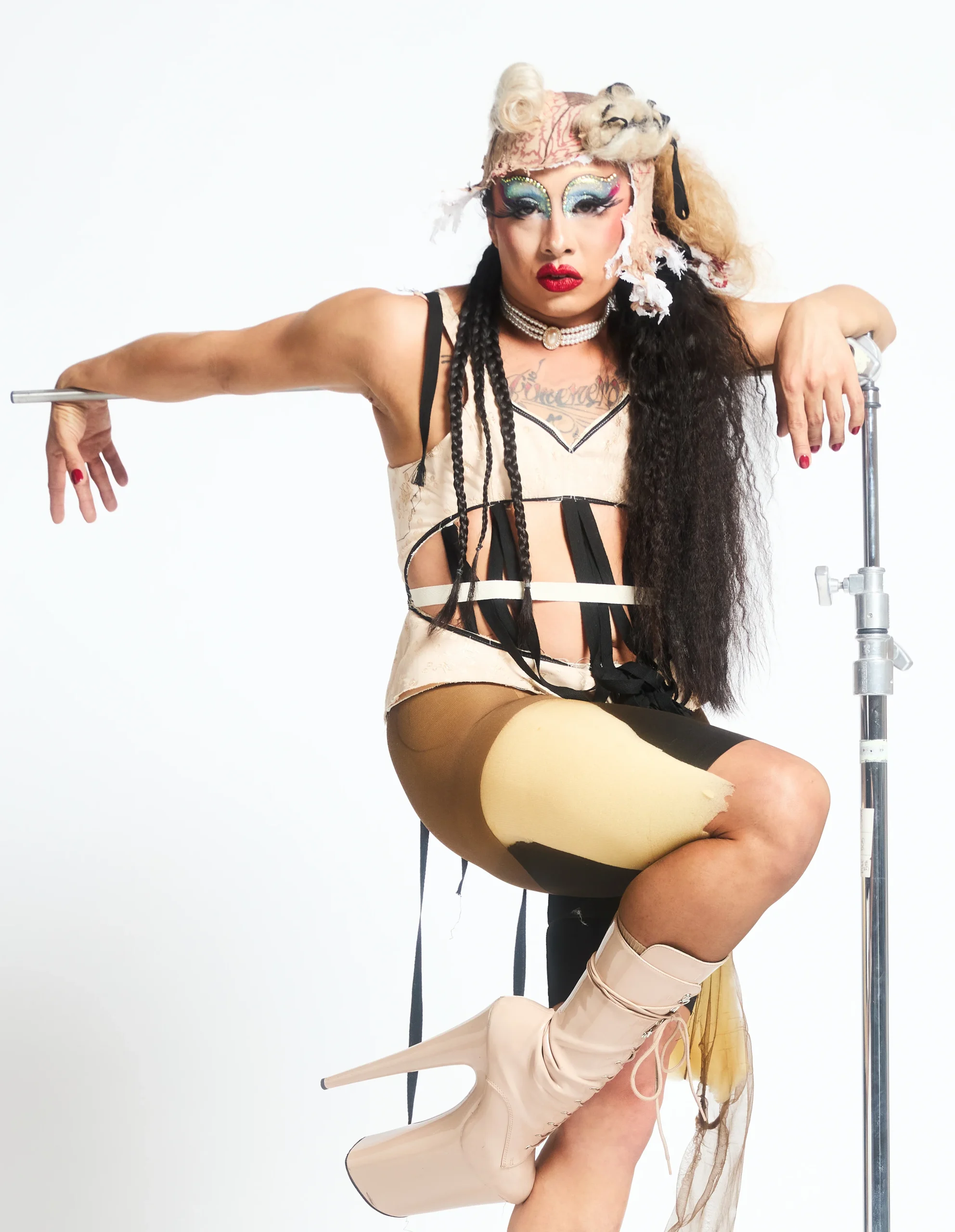
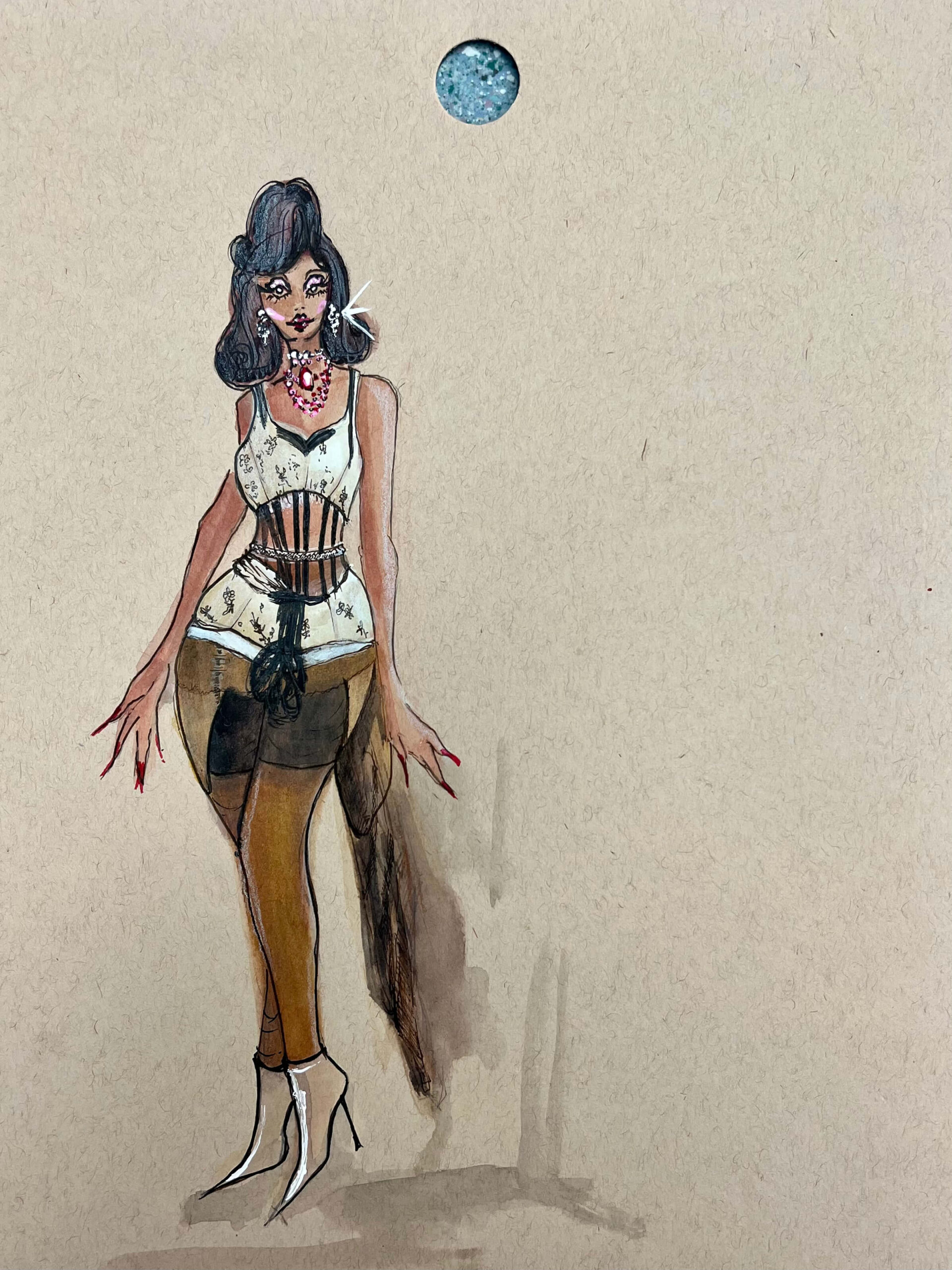
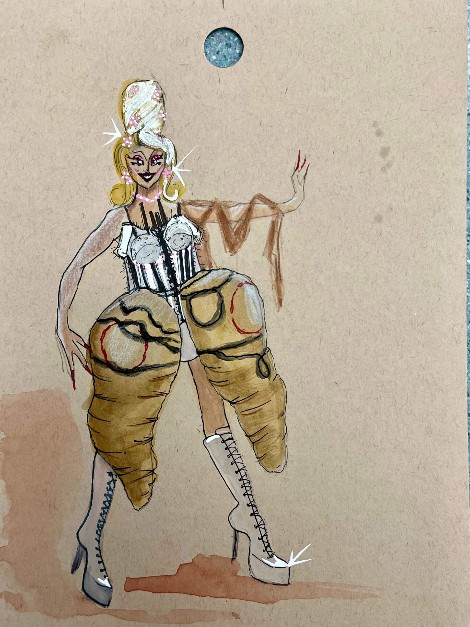
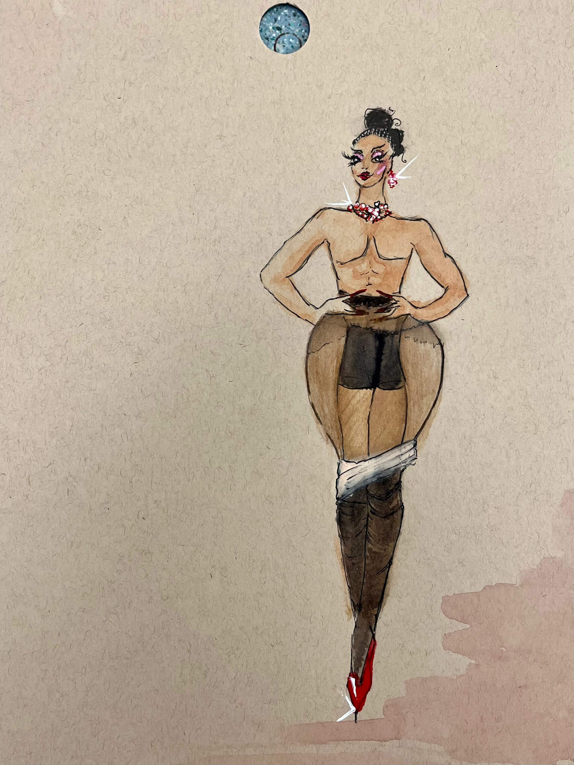
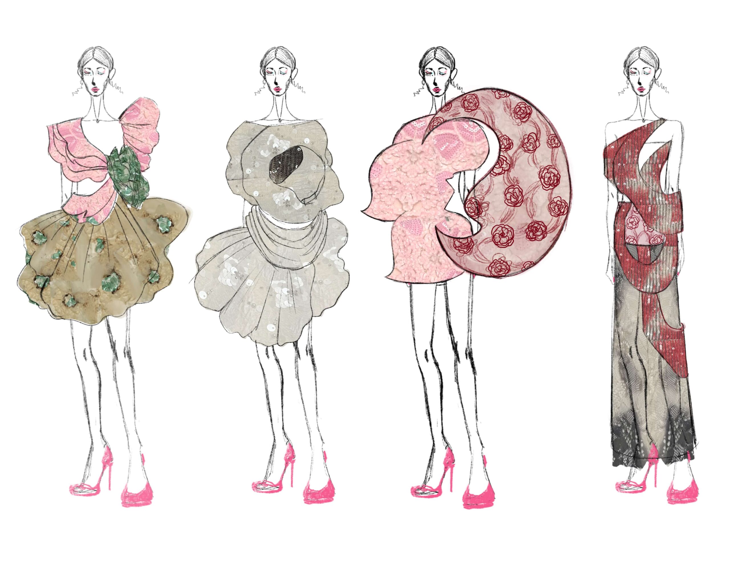
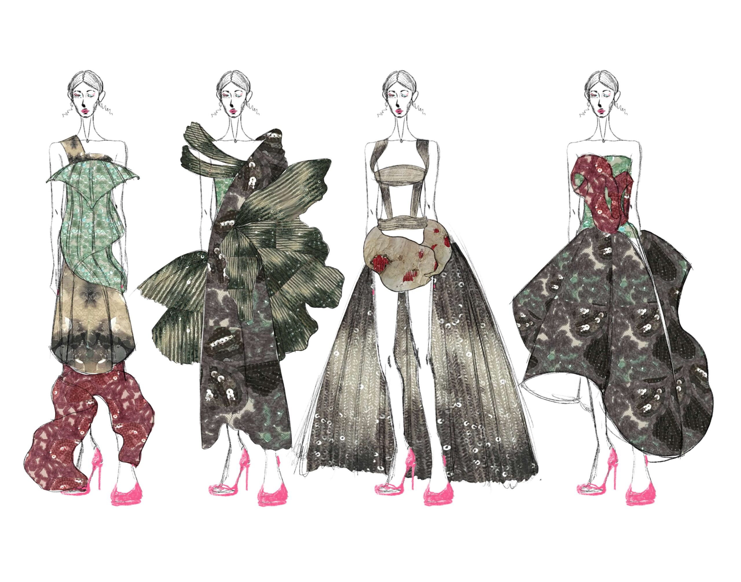
MFA Costume Designer Patric Yikun Wang’s collection celebrates drag and the art of transformation, showcasing an impressive balance between glamour and elegance and the grotesque imagery. Corsets and padding are crafted with used materials. Through the use of stacking and teasing wigs and his knowledge of millinery, he creates giant, structured headwear pieces to work as companions to his garments. “I am inspired with building the body shape and padding using all these scraps and things around the queer community, like condoms, which are associated with AIDS, and pills.” Patric explained, “We can have so much information and messages just in the garment itself. Drag, on a larger scale, is what we do every single day when we put a garment on, when we step out the door, to talk to people, while playing a character. “
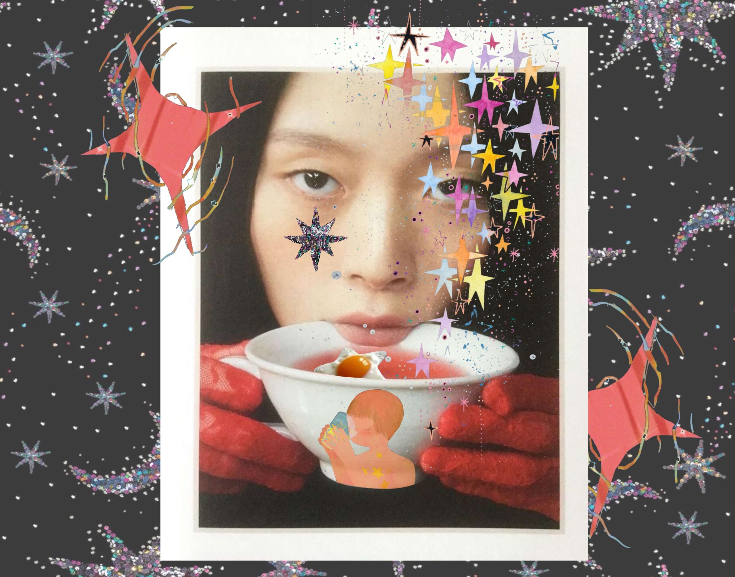
BFA Fashion Designer Vanda Ouyan decided to use her collection to embrace nostalgia. Titled “The Smell of Stars”, her concept takes the audience on a journey of what one can imagine stars would smell and taste like. This would include certain scents such as gunpowder, liquid metal, and even welding fumes. She translates these sensory impressions into her design with the experimentation of burning the fabrics to create raw, uncontrolled textures. She implements sequins and delicate lace to capture the radiant, shimmery quality of stars. Vanda explained that her collection is inspired by the book The Little Prince by Antoine de Saint-Exupery. ““From my childhood memories of reading a book by myself, biting my fingers, and having that sensorial curiosity, it made me want to explore other random things in depth” shared Vanda.” It was the first book I remember being able to read by myself, and it was the moment where I realized I was much stronger than I thought.” The silhouettes and fabric of Vanda’s garments blend the harmonious use of puffy dresses, and structured but edgy necklines. There is such movement in the clothes that allows you to transport to the swirly clouds of stars, dust, and gas. The burning fabrics against the gleaming sequins are a fusion of the luminous balls of gas covered in a veil of lace. The use of boning helps shaping the silhouettes, giving them a sculptural and ethereal presence. The shapes include other cosmic elements such as the crescent moon, and the enormous empty space that is the galaxy.
Vanda Ouyang BFA Fashion Design
Road to Sustainable Fashion
Lydia Buesgens (BFA, Fashion Design) gives us a sneak peak at her senior thesis collection. Armed with the tools and skills to make an impact on the fashion industry, Lydia focuses on the future of fashion and designing environmentally sustainable clothing.
Fashion Courses
Academy of Art University’s School of Fashion offers degree options that span the fashion career spectrum: marketing, visual merchandising, journalism, communications, styling, and product development. Our graduates are skilled, experienced, and connected—fully prepared to forge their unique identities in the fashion industry.
The School of Fashion has been hosting the Graduation Fashion Show since 2011 when the designs of Academy students first graced the runways of New York Fashion Week. For over a decade now, the Academy’s captivating showcases have featured the next generation of fashion designers and cutting-edge trends. Explore the artistry and craftsmanship and see how an Academy fashion education translates into magic on the runway.